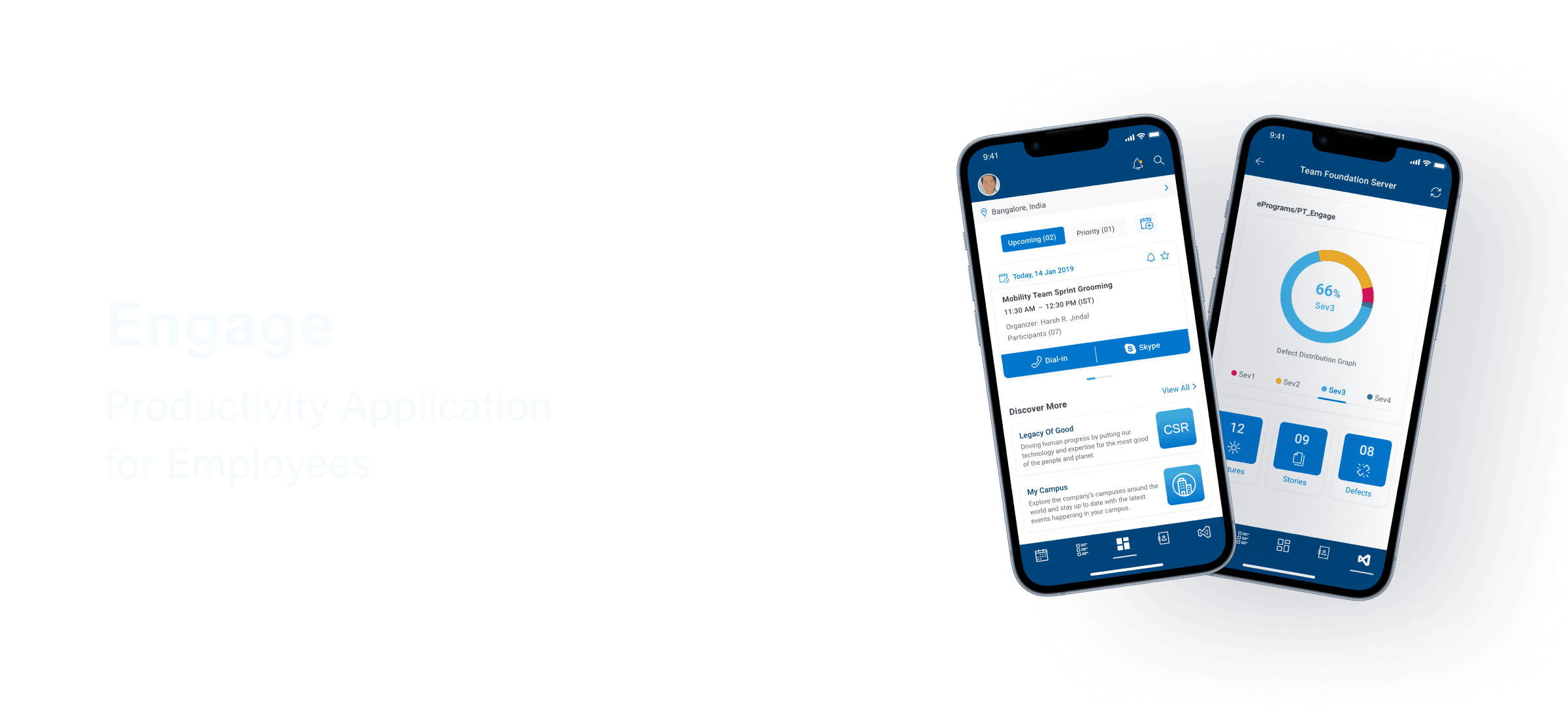


Engage: Productivity Application for Employees
Engage: Productivity Application for Employees
Engage: Productivity Application for Employees
Computer Technology
Computer Technology
Computer Technology
B2E
B2E
B2E
Mobile (Native)
Mobile (Native)
Mobile (Native)
Project Overview
Project Overview
Project Overview
About Client
About Client
About Client
The client is a leading American multinational company that provides digital technology solutions, services and personal computing products.
The client is a leading American multinational company that provides digital technology solutions, services and personal computing products.
The client is a leading American multinational company that provides digital technology solutions, services and personal computing products.
Project Goal
Project Goal
Project Goal
The goal was to design an enterprise application to help boost the day-to-day productivity of the employees, by enabling them to efficiently manage and track their meetings, tasks, collaboration activities and other engagements.
The goal was to design an enterprise application to help boost the day-to-day productivity of the employees, by enabling them to efficiently manage and track their meetings, tasks, collaboration activities and other engagements.
The goal was to design an enterprise application to help boost the day-to-day productivity of the employees, by enabling them to efficiently manage and track their meetings, tasks, collaboration activities and other engagements.
Role
Role
Role
User Experience Designer
User Experience Designer
User Experience Designer
Time Frame
Time Frame
Time Frame
2 Months (Jan 2020 - Feb 2020)
2 Months (Jan 2020 - Feb 2020)
2 Months (Jan 2020 - Feb 2020)
Tools
Tools
Tools
Adobe XD, Adobe Illustrator & Google Sheets
Adobe XD, Adobe Illustrator & Google Sheets
Adobe XD, Adobe Illustrator & Google Sheets
My role and responsibilities
To begin the project, I gathered business requirements from key stakeholders, which helped me obtain a precise understanding of the project's vision and goals. Additionally, I took the initiative to clarify my own responsibilities and deliverables, ensuring a shared understanding of expectations among all stakeholders.
Responsibilities
Conduct user research and interviews to gather insights into user demographics, user needs and challenges.
Evaluate user research to prioritise user goals, define information architecture, perform task flow analysis and create user flows.
Outline set features to help employees manage their tasks and other day-to-day activities more proficiently.
Extend their existing interaction pattern library to meet the requirements
Create high-fidelity prototype following design standards and brand guidelines of the company.
User Research
Conducted semi-structured interview with the key user group.
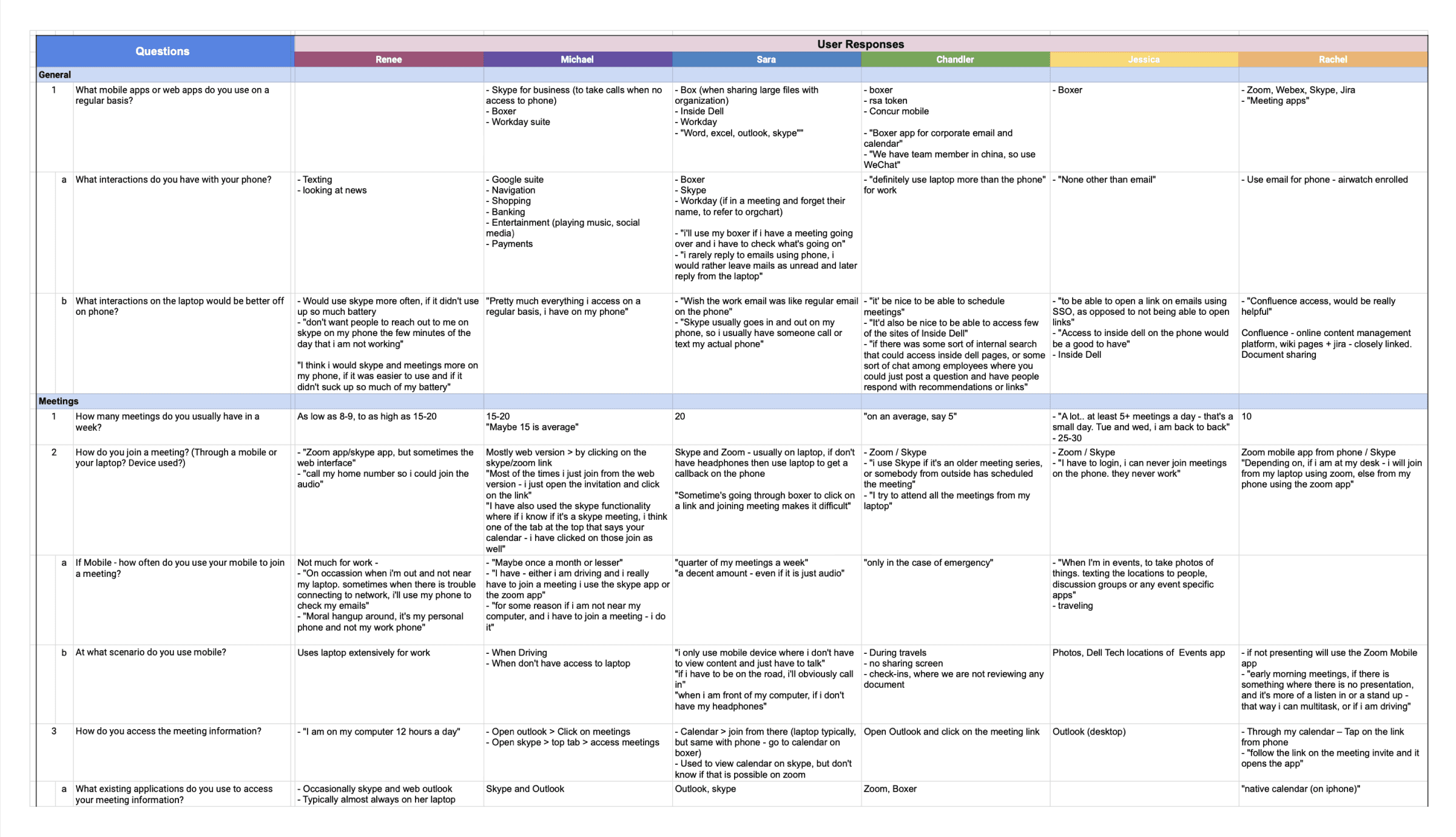
Conducted remote 1:1 interviews with employees to gain insights into their daily engagements, task priorities, task management, productivity strategies, as well as their needs and challenges.
Research Synthesis
Analysing user research to identify similar needs and challenges.
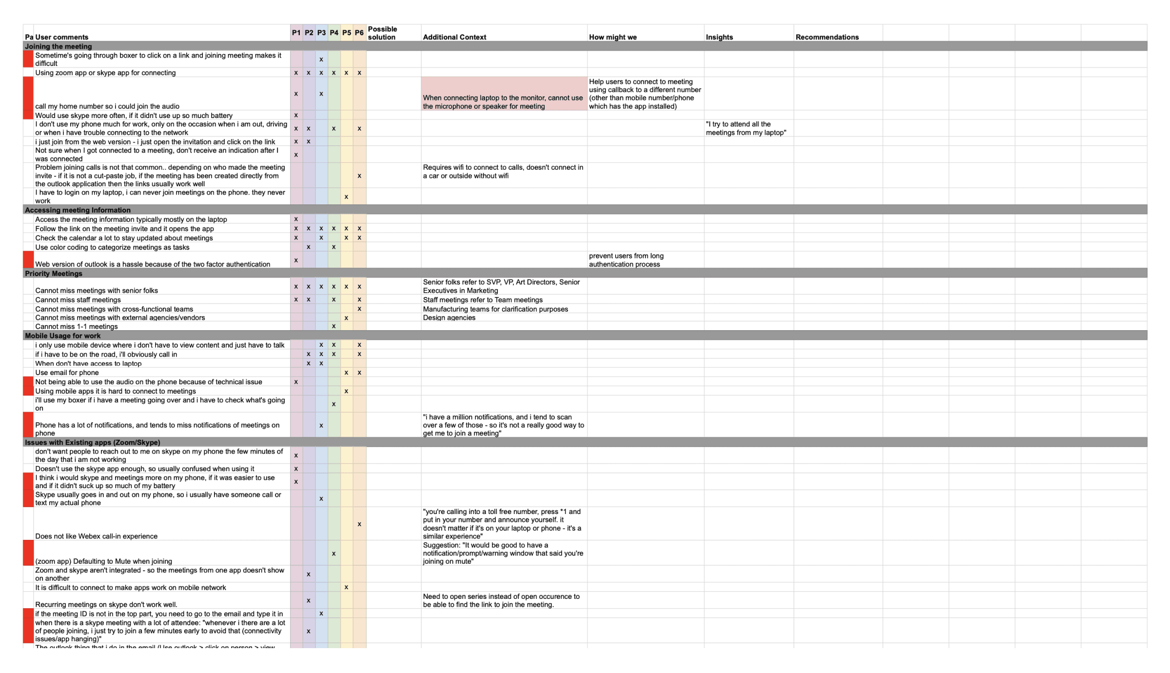
To transform qualitative data into a quantitative format, I utilised a Rainbow Spreadsheet. This allowed me to record and categorise common occurrences from user interviews, providing an overview of how many users encountered similar needs or challenges. This visualisation helped in analysis and prioritisation of user needs.
Aligning business goals with user needs
Prioritising and aligning common needs of the user with the business goals.
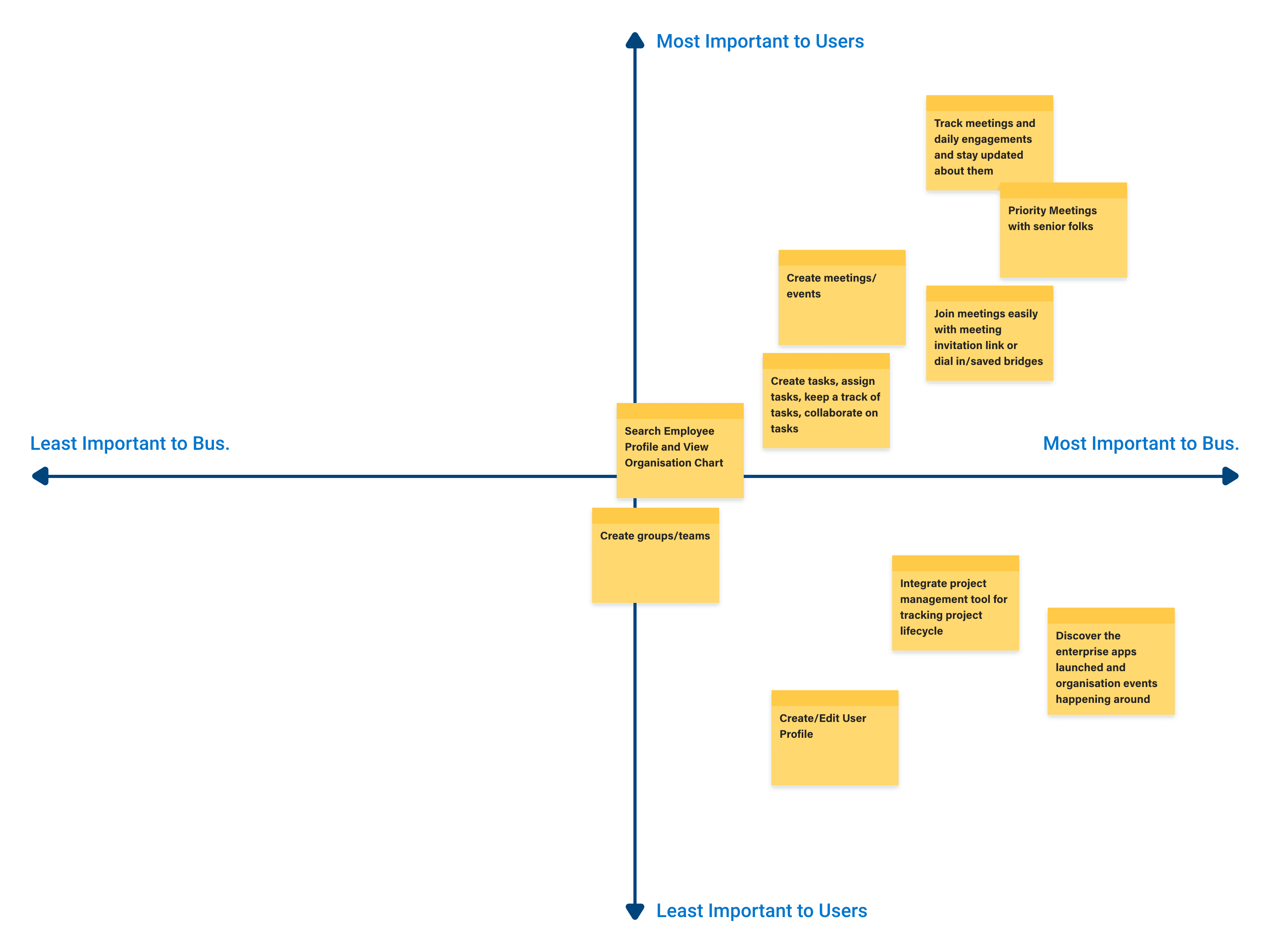
Utilising Axis Mapping to align user needs with business goals to further prioritise them into actionable feature requests.
Competitive Analysis
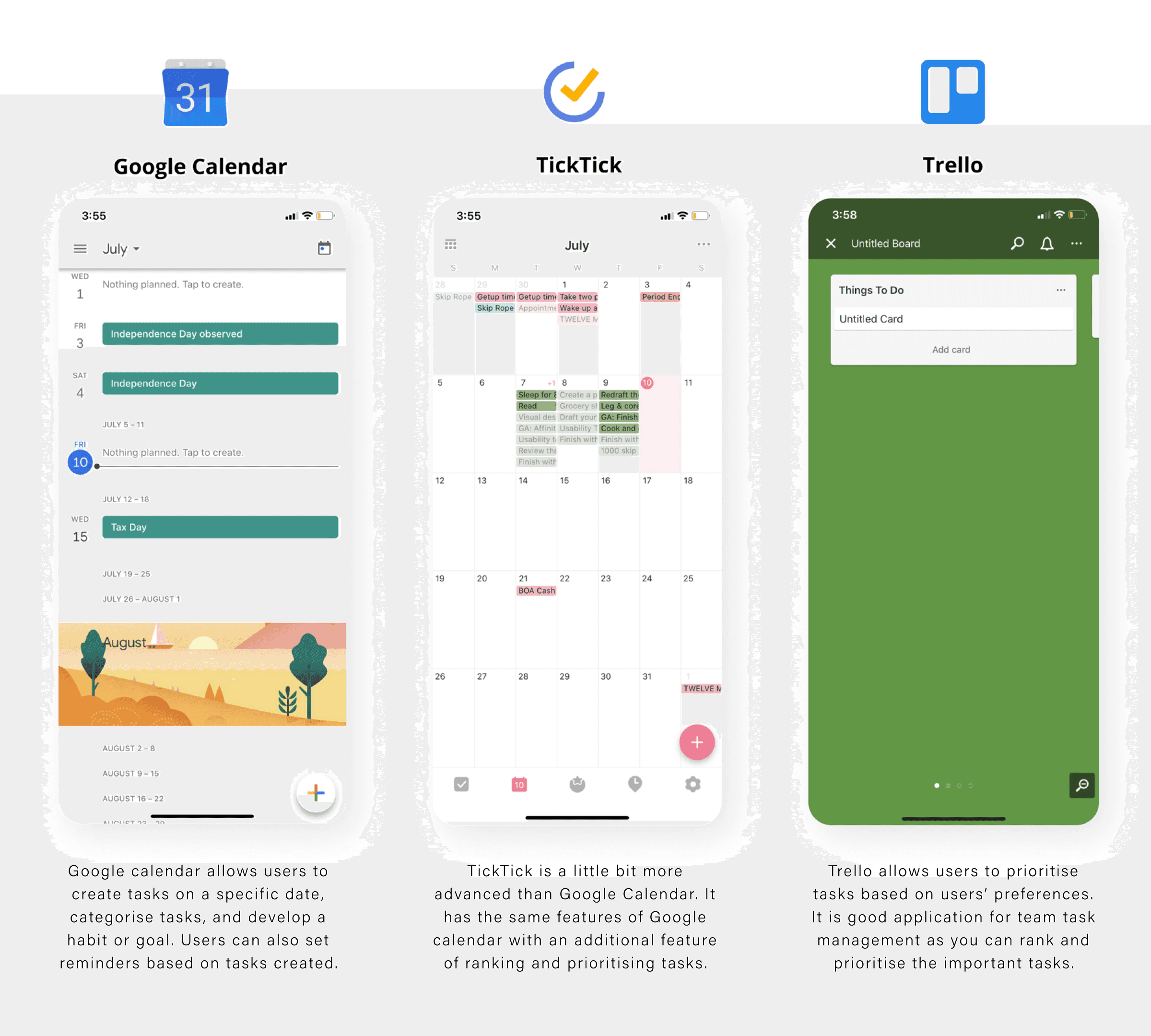
Before diving into the ideation process, I did around of competitive analysis to learn the current productivity and time management tools: what they are doing well or not well, and what features they are lacking.
Ideation Process
The process involved brainstorming to identify and prioritise features required to address user needs, visualise a clear information hierarchy and define user flows to help understand interactions from the users’ point of view.
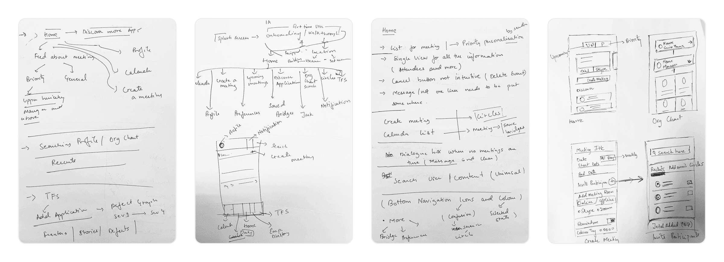
Brainstorming and listing down all the potential features to address the different needs of the users
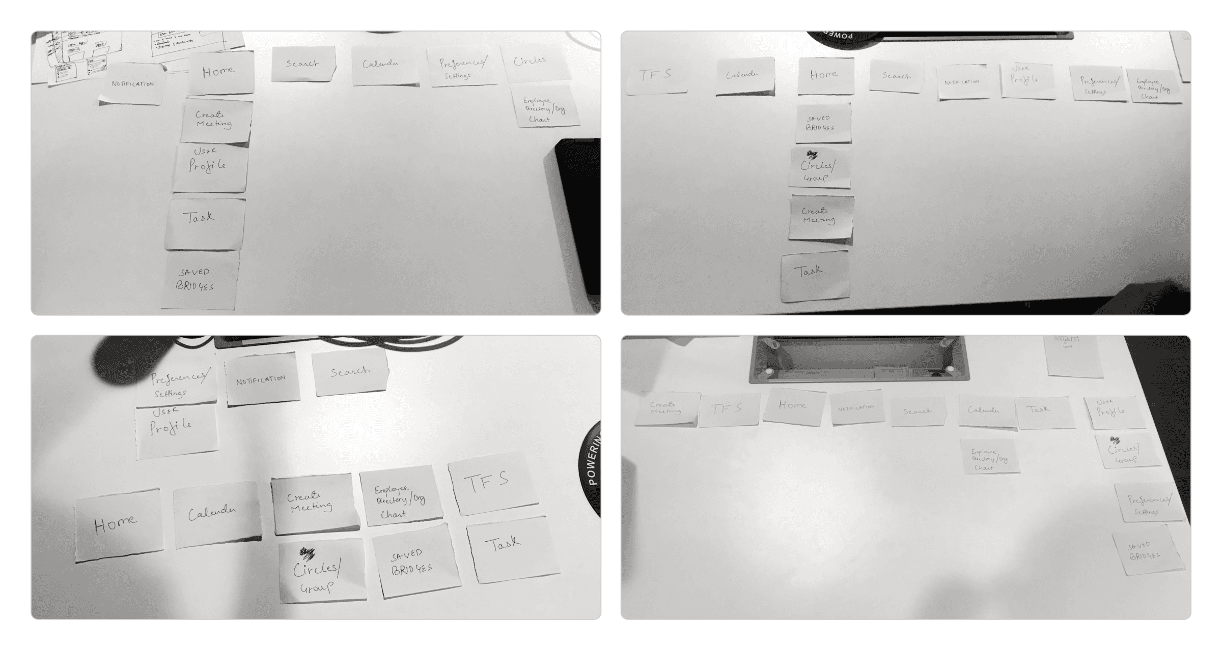
Conducted a closed card sorting activity with users to ensure all the information and content hierarchy are categorised based on their understanding.
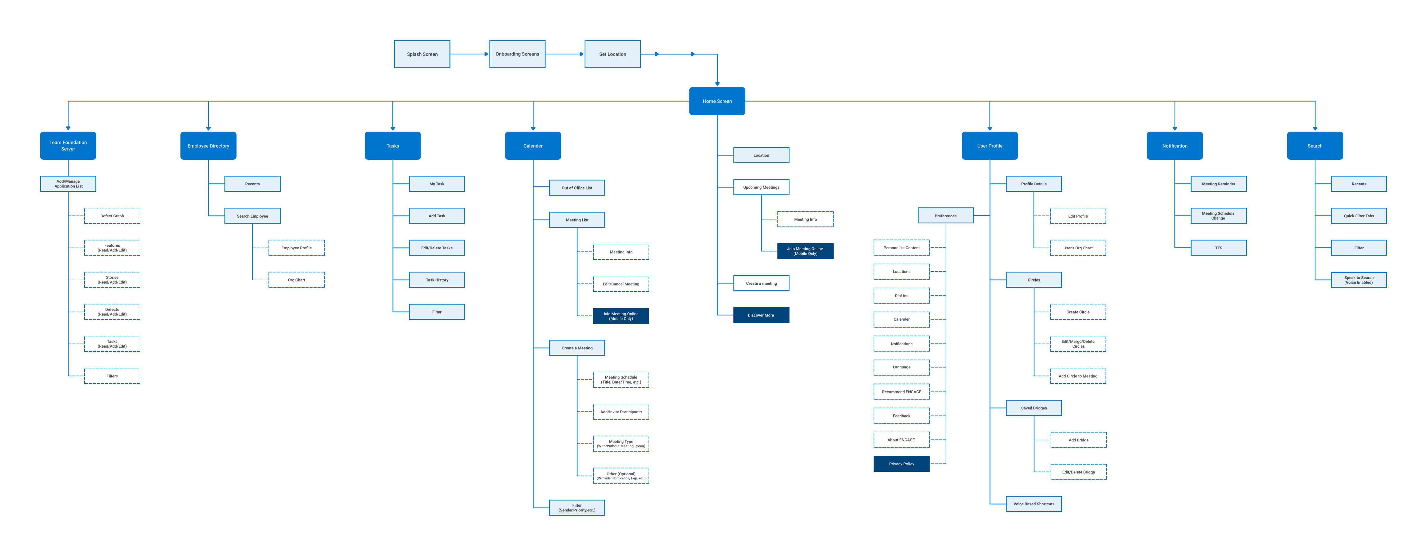
Information architecture
Global
Local
Contextual
External Link
Final Solution
Stay on top of your daily engagements
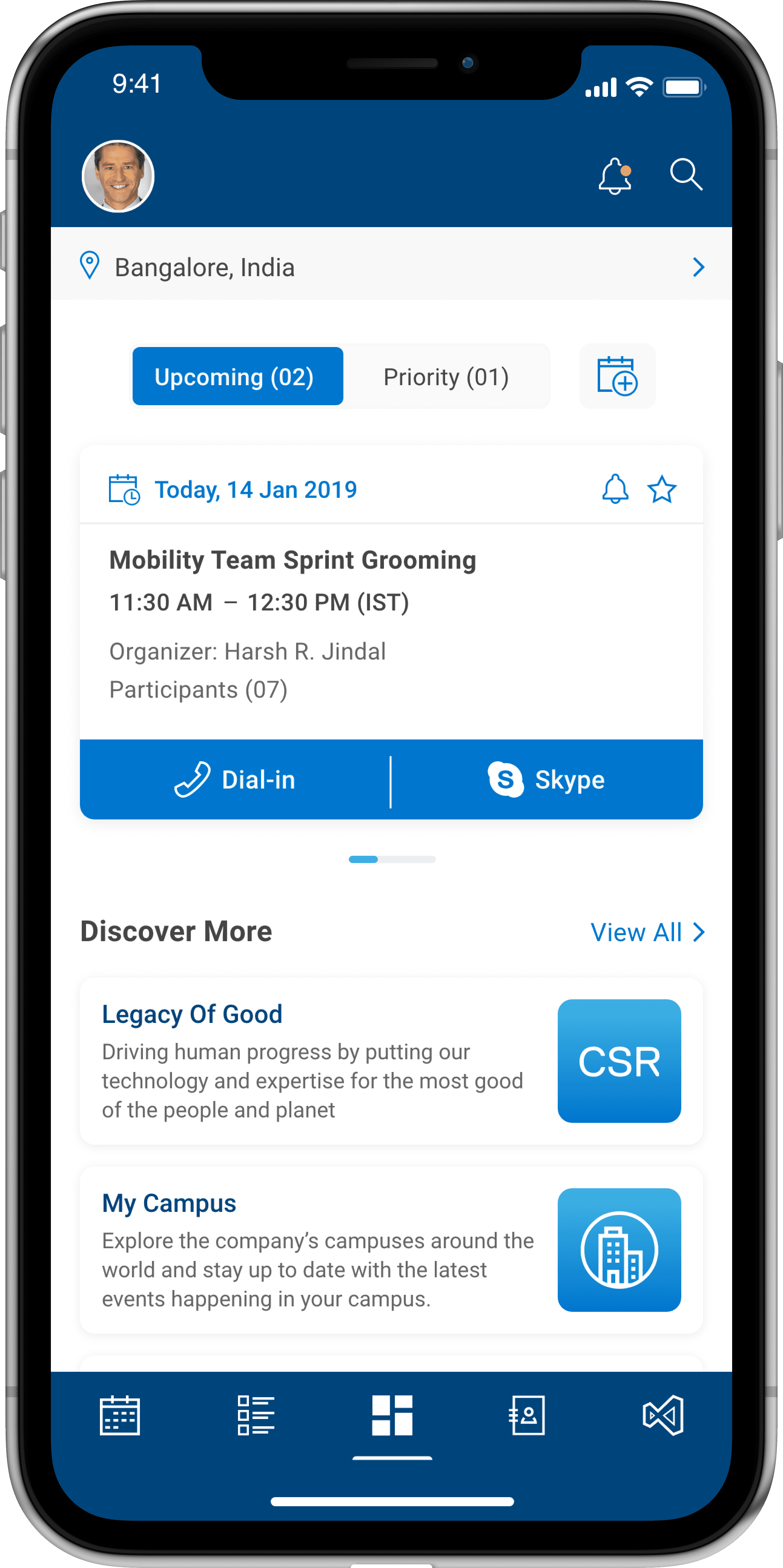
Home Screen
Stay informed about upcoming engagements, easily join them with a single tap, and explore new enterprise applications and organisational events.
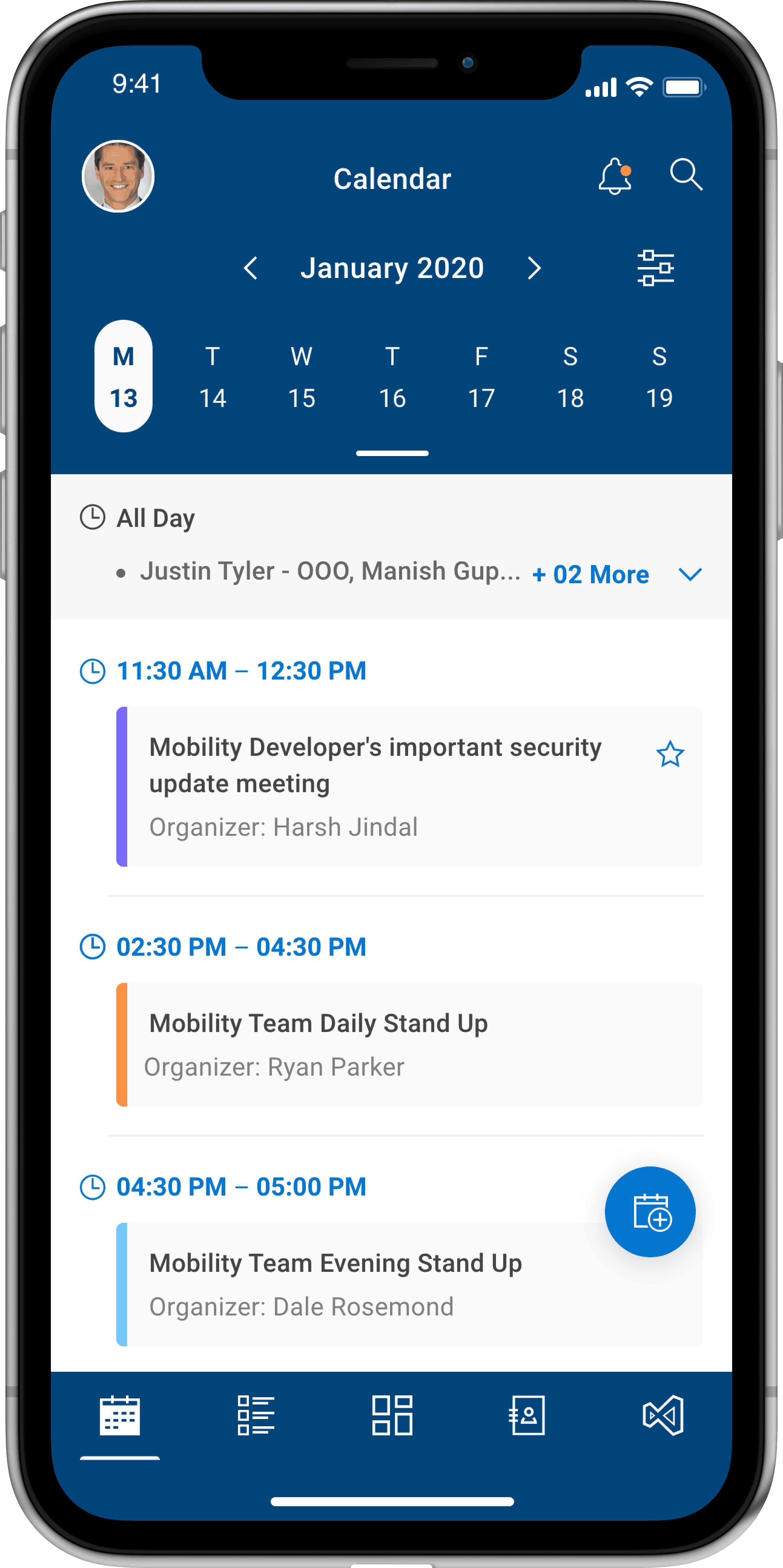
Calendar
Efficiently create, manage and prioritise your daily engagements while keeping your team informed about your availability and status.
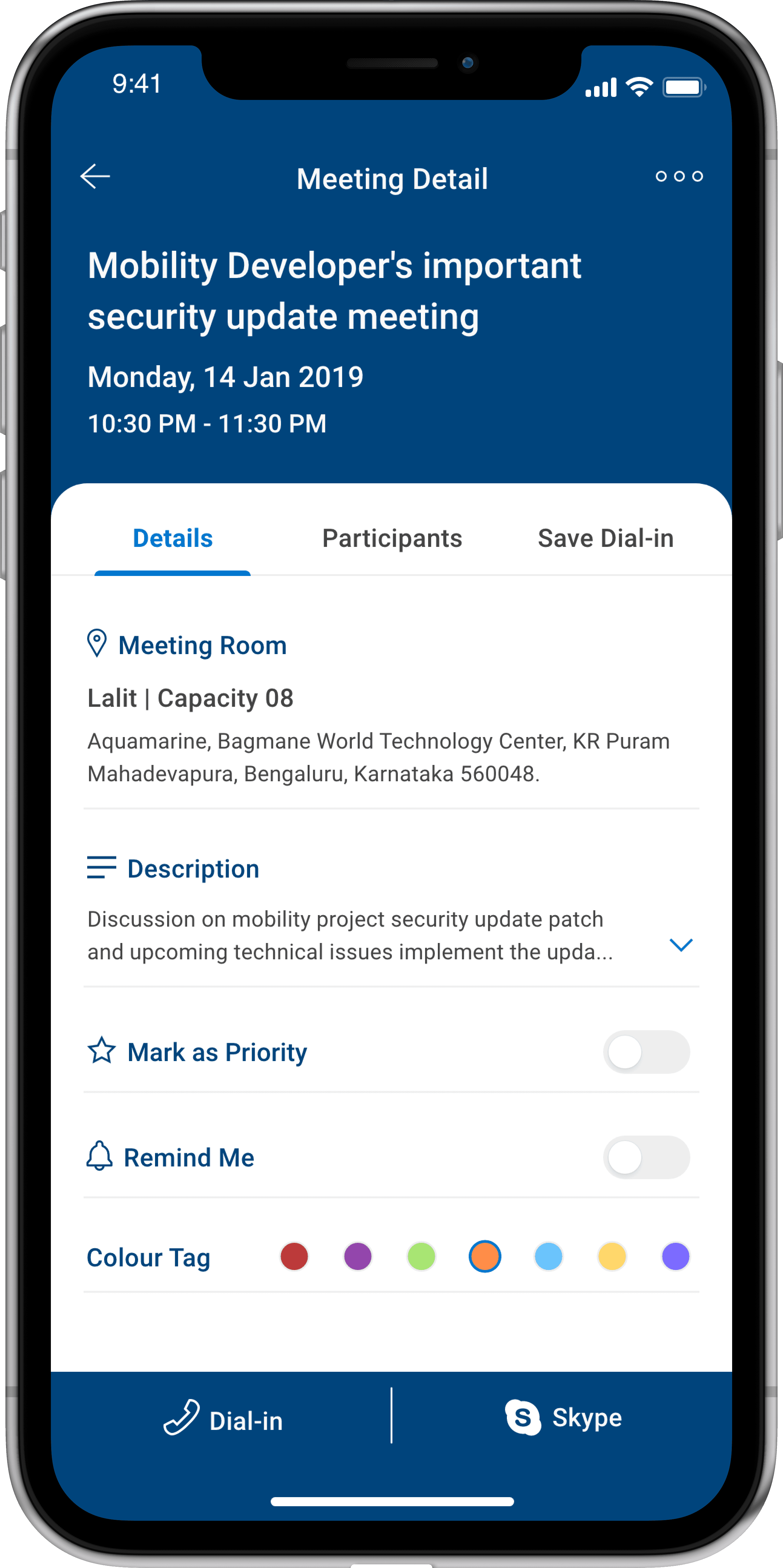
Meeting Detail
Get a overview of your meeting or event invitations, with the ability to prioritise, set reminders, and save
dial-in information.
Schedule your events anytime, anywhere
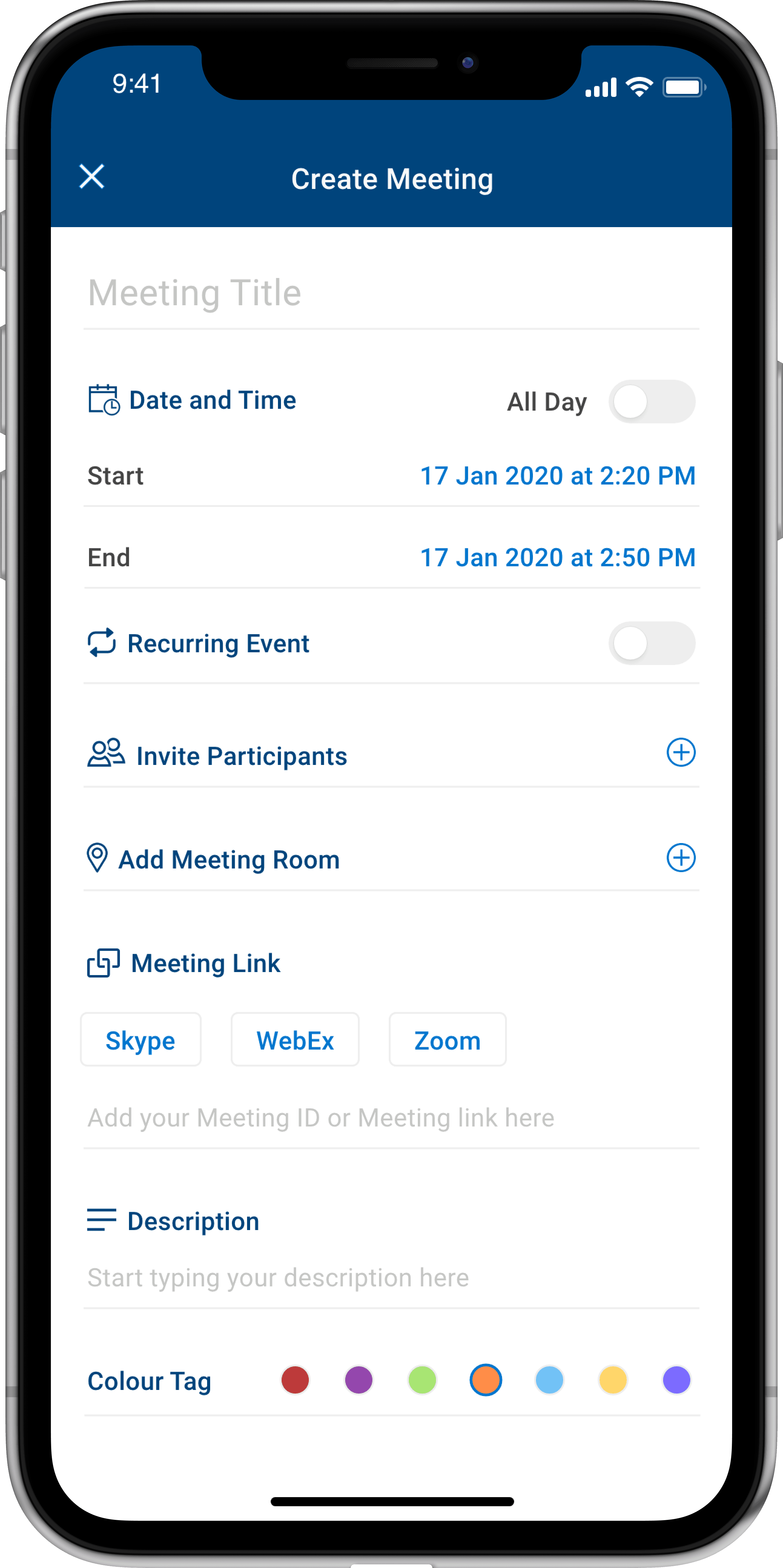
Create Meeting
Create meetings or events with the flexibility to choose from a popular variety of video-conferencing platforms used by your collagues.
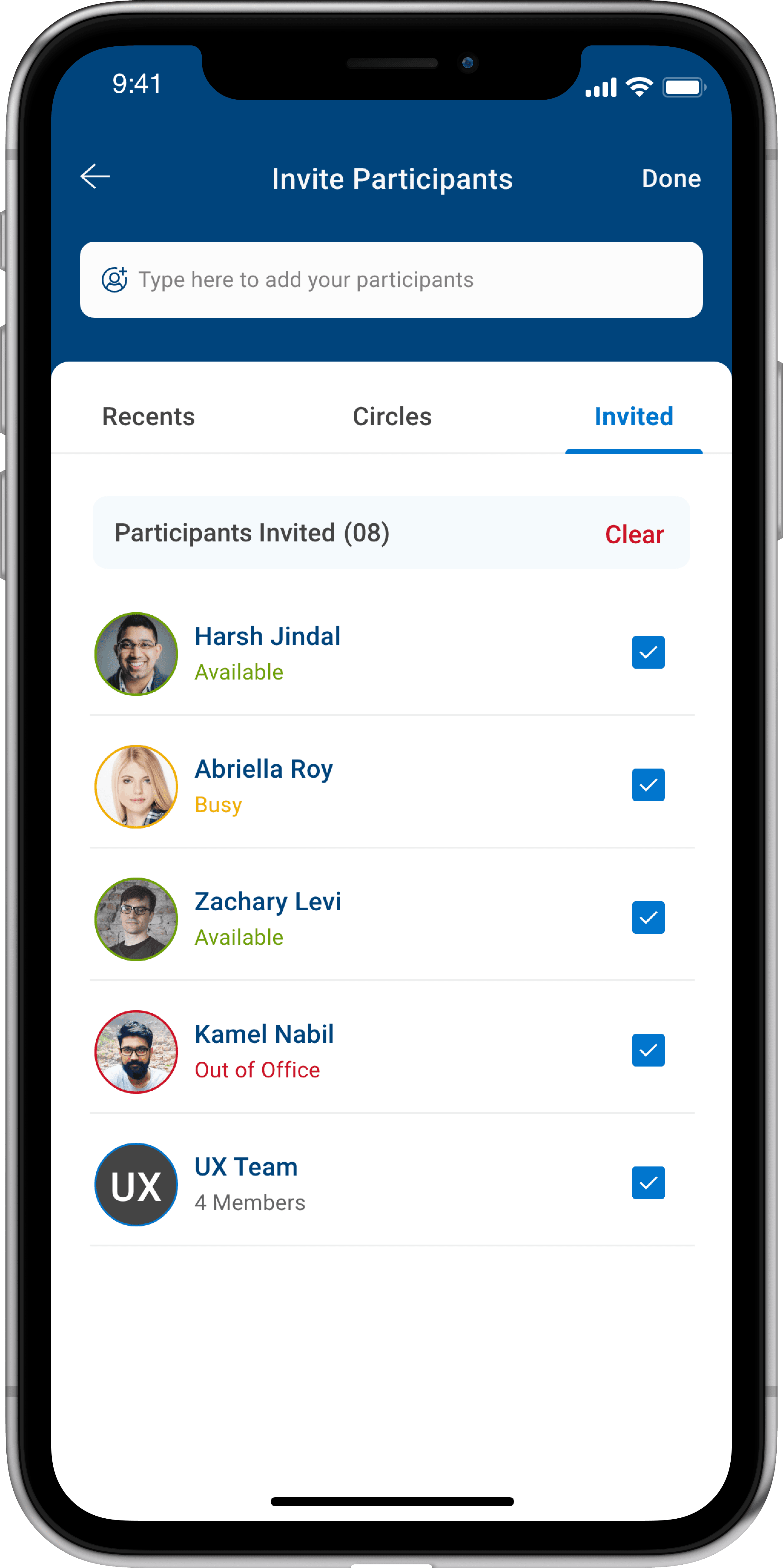
Invite Participants
Send invitations to participants by selecting them from your recent list or by creating groups (circles).
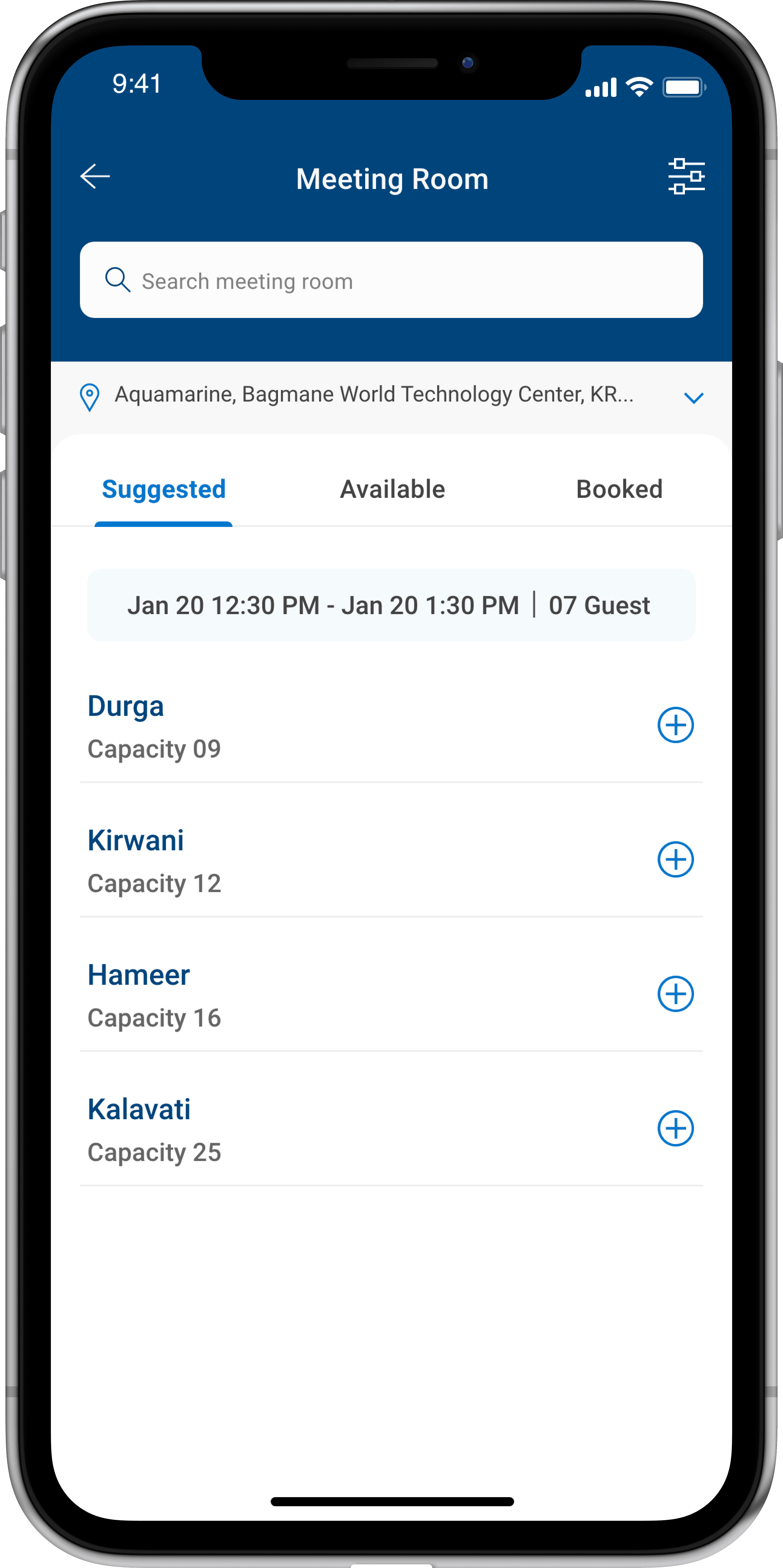
Meeting Room
Get recommendations for available meeting rooms based on the total attendee's strength.
Boost your productivity and build connections
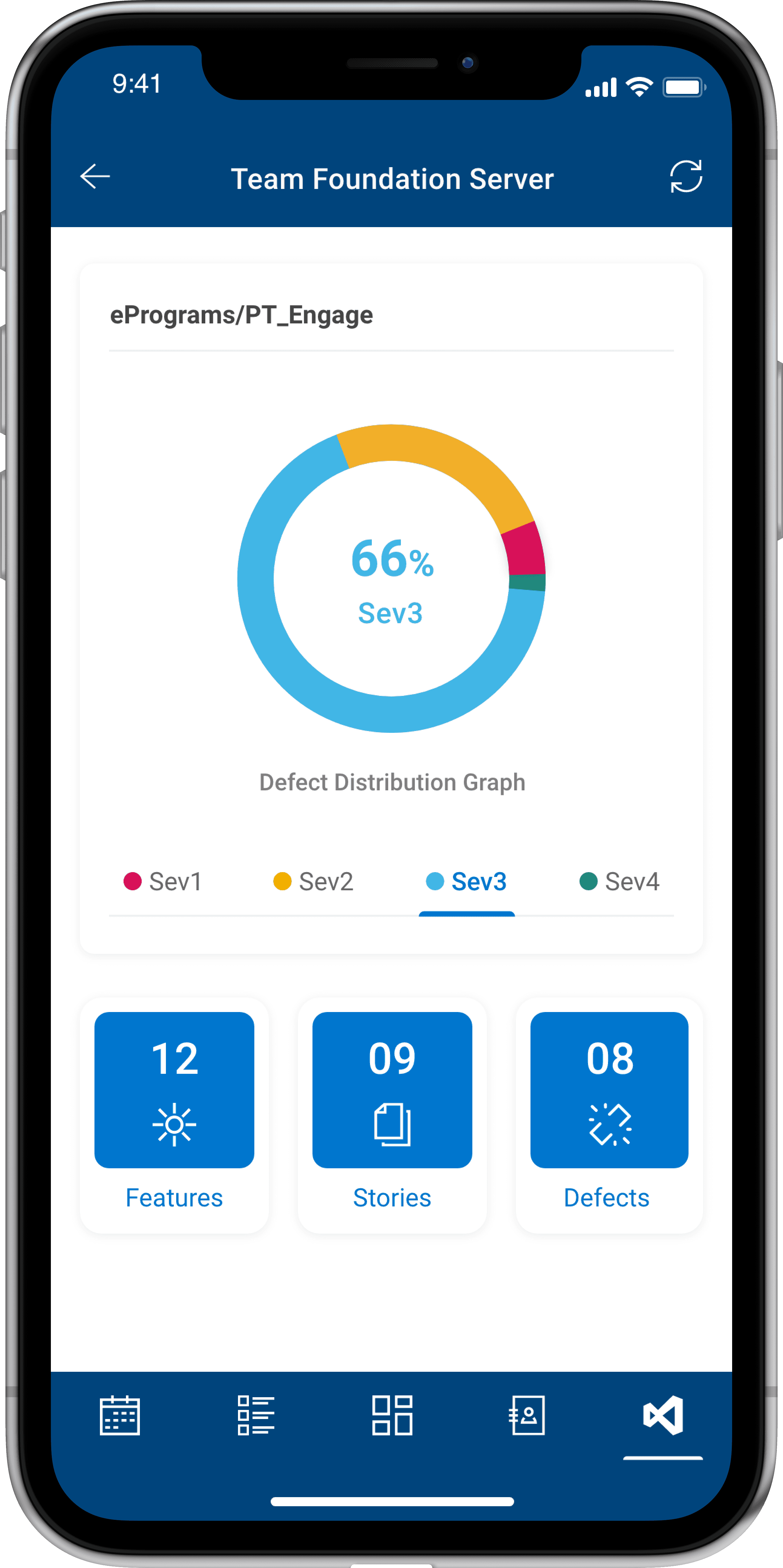
Project Management
Integrated the project management tool used by the organisation to help plan, manage and track team and the product development lifecycle.
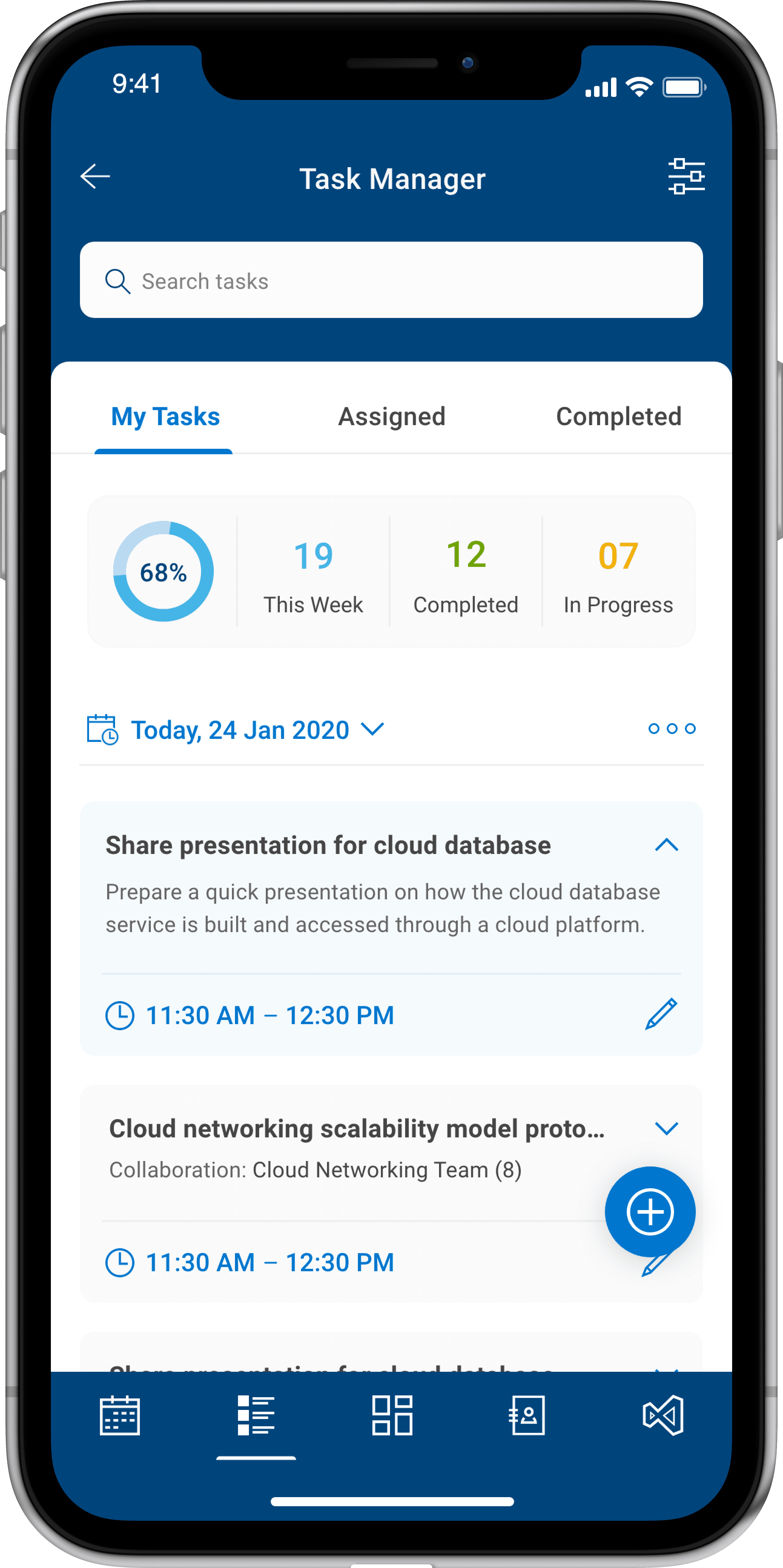
Task Manager
Create and track your daily tasks, activities and goals. Collaborate with colleagues by assigning and working on tasks together .
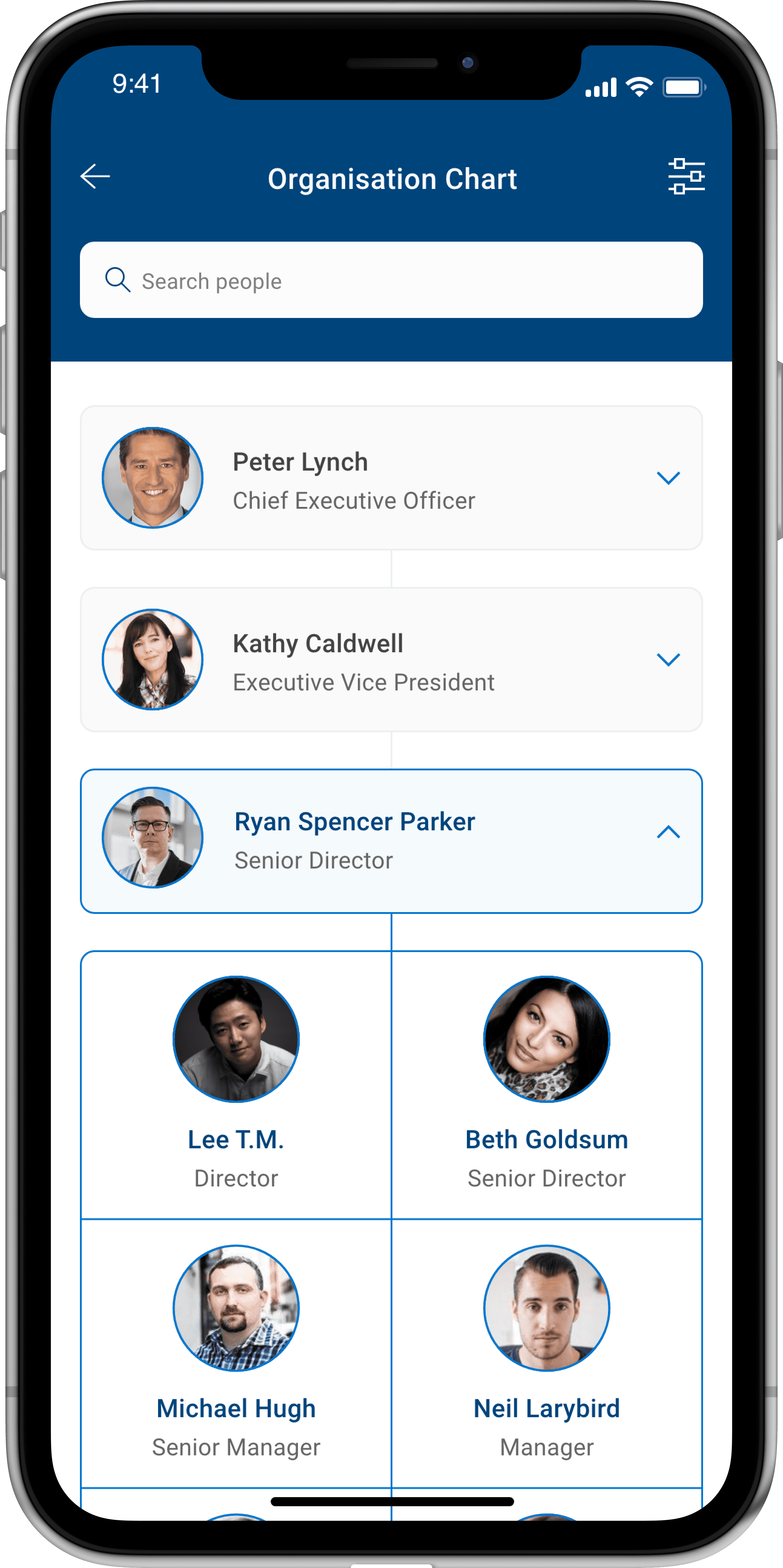
Organisation Chart
A visual representation to illustrate the structure and relationships you share among each individual employee within the organisation
The remaining part of my case study is currently not optimised for this resolution. Kindly switch to your desktop or laptop device with a resolution of 1280px or higher to view the rest of it.
Apologise for the inconvenience caused 🫣


The remaining part of my case study is currently not optimised for this resolution. Kindly switch to your desktop or laptop device with a resolution of 1280px or higher to view the rest of it.
Apologise for the inconvenience caused 🫣

