

Revamping Landing Page for Pre-owned Car Buyers
Revamping Landing Page for Pre-owned Car Buyers
Revamping Landing Page for Pre-owned Car Buyers
Automotive
Automotive
Automotive
B2C
B2C
B2C
Mobile & Desktop (Web)
Mobile & Desktop (Web)
Mobile & Desktop (Web)
The remaining part of my case study is currently not optimised for this resolution. Kindly switch to your desktop or laptop device with a resolution of 1280px or higher to view the rest of it.
Apologise for the inconvenience caused 🫣


The remaining part of my case study is currently not optimised for this resolution. Kindly switch to your desktop or laptop device with a resolution of 1280px or higher to view the rest of it.
Apologise for the inconvenience caused 🫣


Project Overview
Project Overview
Project Overview
Project Goal
Project Goal
Project Goal
Revamping the existing B2C (buy) landing page to enhance the search and discovery experience for pre-owned car buyers.
Revamping the existing B2C (buy) landing page to enhance the search and discovery experience for pre-owned
car buyers.
Revamping the existing B2C (buy) landing page to enhance the search and discovery experience for pre-owned car buyers.
Success Metrics
Success Metrics
Success Metrics
Increase in the conversion rate from landing page to Listing/ADP/Lead
Decrease in the overall bounce + exit rate from the landing page
Higher adoption/usage of search functionality
Increase in the conversion rate from landing page to Listing/ADP/Lead
Decrease in the overall bounce + exit rate from the landing page
Higher adoption/usage of search functionality
Increase in the conversion rate from landing page to Listing/ADP/Lead
Decrease in the overall bounce + exit rate from the landing page
Higher adoption/usage of search functionality
Team
Team
Team
User Experience Designer - Me and Nitin Shekhar
User Research - Lizeth Herrera and Semih Buzcu
User Experience Designer - Me and Nitin Shekhar
User Research - Lizeth Herrera and Semih Buzcu
User Experience Designer - Me and Nitin Shekhar
User Research - Lizeth Herrera and Semih Buzcu
Time Frame
Time Frame
Time Frame
3 Months (Mar 2023 - May 2023)
3 Months (Mar 2023 - May 2023)
3 Months (Mar 2023 - May 2023)
Tools
Tools
Tools
Figma, Miro & UserTesting
Figma, Miro & UserTesting
Figma, Miro & UserTesting
Context
The B2C (buy) landing page serves as the entry point for users interested in purchasing a pre-owned car through OLX Autos. Its purpose is to provide information about OLX Autos, guide users through the buying process, and establish trust through relevant content.
Additionally, the page facilitates the users' journey towards making a transaction by allowing them to navigate into the car listings/ads and assisting them in finding their desired car.
Why do we need
a redesign?
Insights from current metrics indicate low conversion rates, high drop-off rates, and lack of user engagement. This highlights a significant opportunity to enhance the landing page experience, prioritise customer-centricity, and improve conversion rates while reducing exit rates.

Current B2C (buy) landing page metrics (Nov'22 to Jan'23) indicate low conversion rates and a high exit rate.
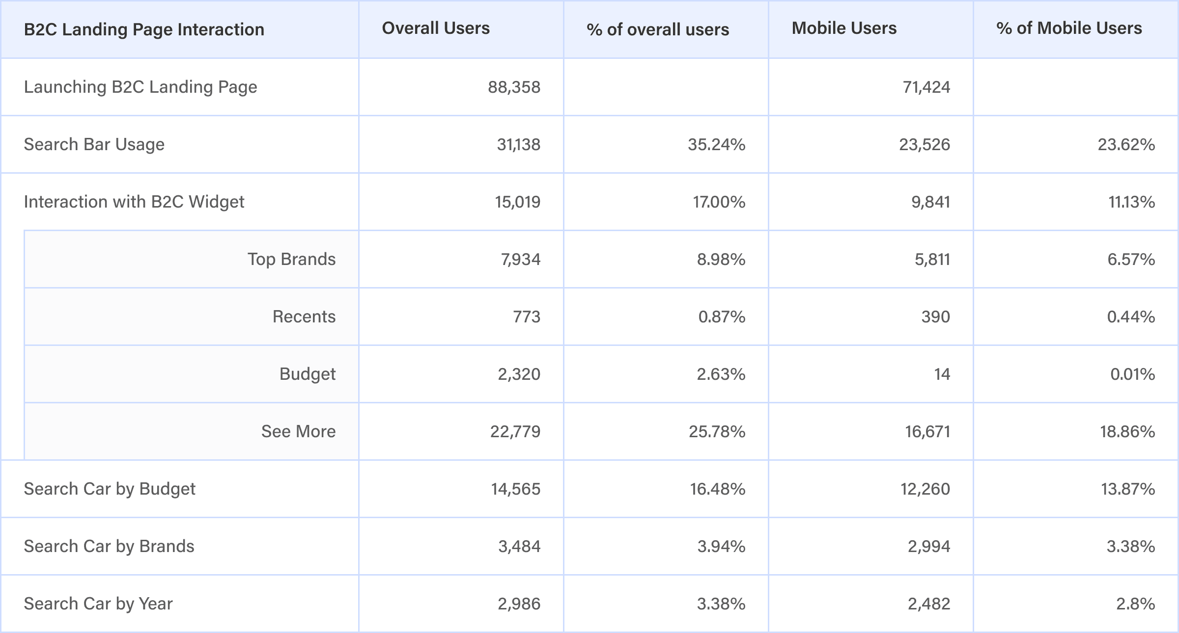
The user interaction metrics for the Mexico B2C (buy) landing page (Nov'22 to Jan'23) indicate low usage of the search and lack of user engagement with B2C widget in the first fold and other listing widgets in the page.
Voice of Customers
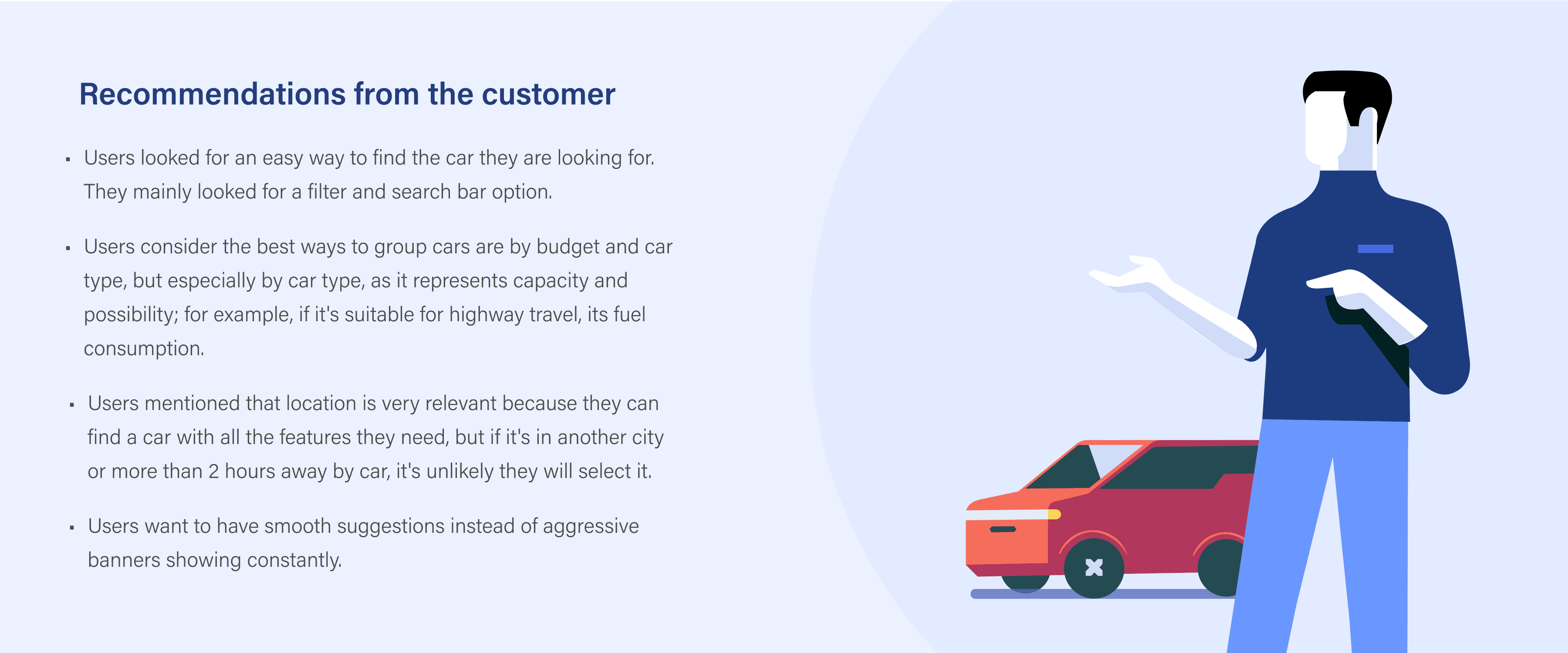
Summarised insights, pain points and recommendations from the user research done for the existing Mexico B2C Landing Page.
Search
The search bar was the most common method for users to find specific cars. They searched by: brand + model + year and sometimes just brand and model.
Navigation Tabs (Sell, Buy, Finance)
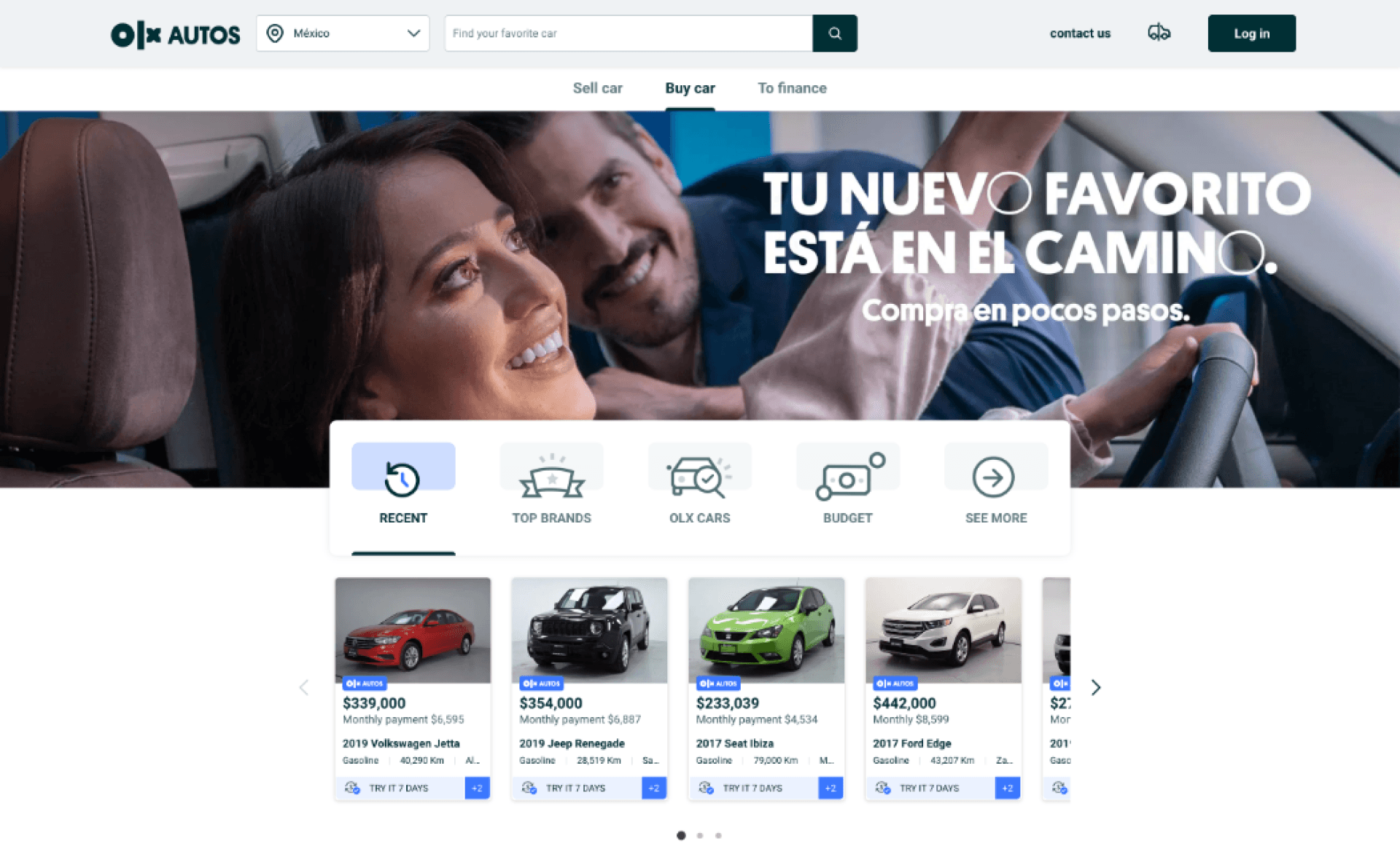
Users are not able to intuitively identify which landing page they are on. The words 'sell' and 'buy' on the website were not very clear or noticeable. Users were interacting with the sell intent widget confusing it for the buy widget.
Banner
Users ignored the large banner, and some found the phrase confusing, initially thinking it referred to specific place.
B2C Widget
Users had difficulty understanding the "Recent" category, as they were unsure whether it referred to recent car models or recently purchased cars listed on OLX.
Users are having difficulty understanding the concept of "Top Brands" and "OLX Cars" on the widget.
Users who selected the "Budget" option received only one recommendation, which caused confusion as they had not provided their budget information.
Most users choose the widget option: See More and navigated into the listings page.
Users did not interact with the arrows in the widget as they anticipated more information upon clicking on the categories.

Value Propositions
Users perceived the value propositions as vague and lacking detailed explanations about the advantages of using OLX Autos as a platform compared to traditional and well-known methods.
Users expressed a desire to have a clear understanding of what OLX Autos does, how it works, and reassurance about the reliability of the company.

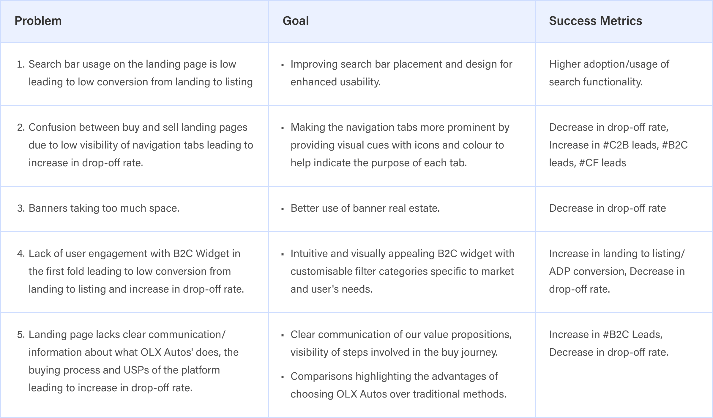
Analysing Problems, Defining Goals and
Success Metrics
Identified the pain points/problems of the users, discovered improvement opportunities, and strategised to create a smoother user journey to help customers to complete their purchase on the platform.
User Persona
Analysed research data from our LATAM, Indonesia, and Turkey markets to find similarities among our buyer user segments.
We identified three personas that represent our buyer segments globally by evaluating psychosocial characteristics, financial needs, online behaviours and purchase decisions.
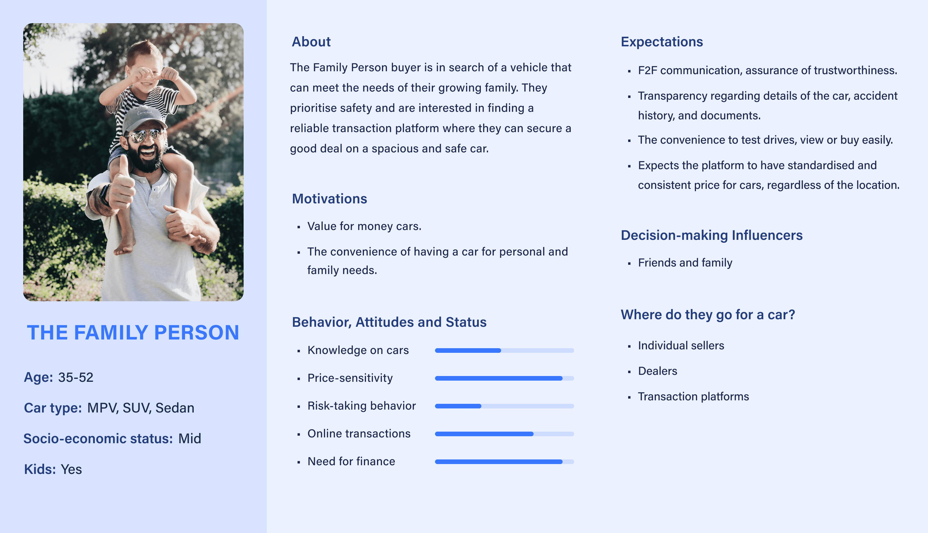
Persona 1: The Family Person (Primary Persona)
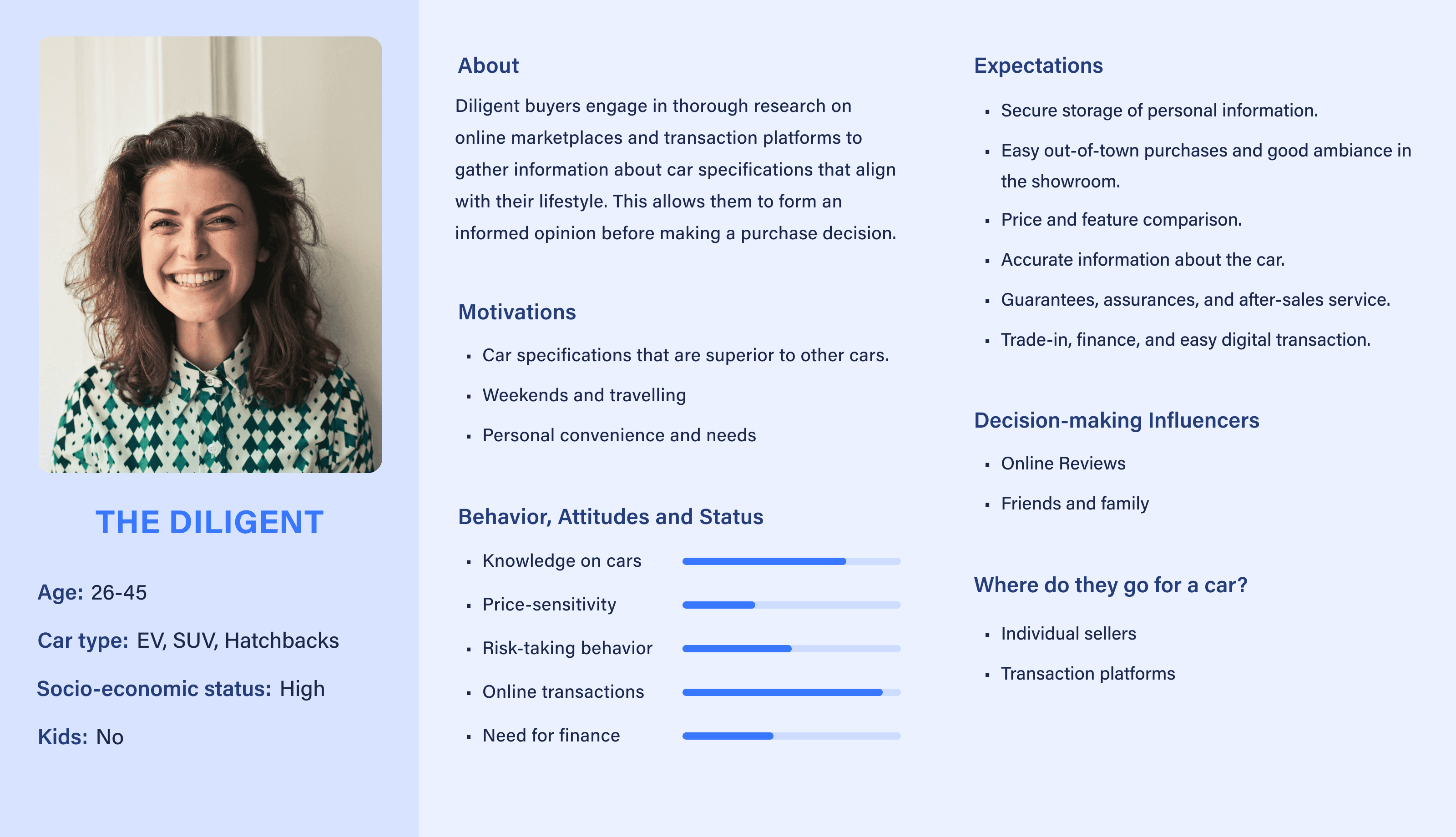
Persona 2: The Diligent (Secondary Persona)
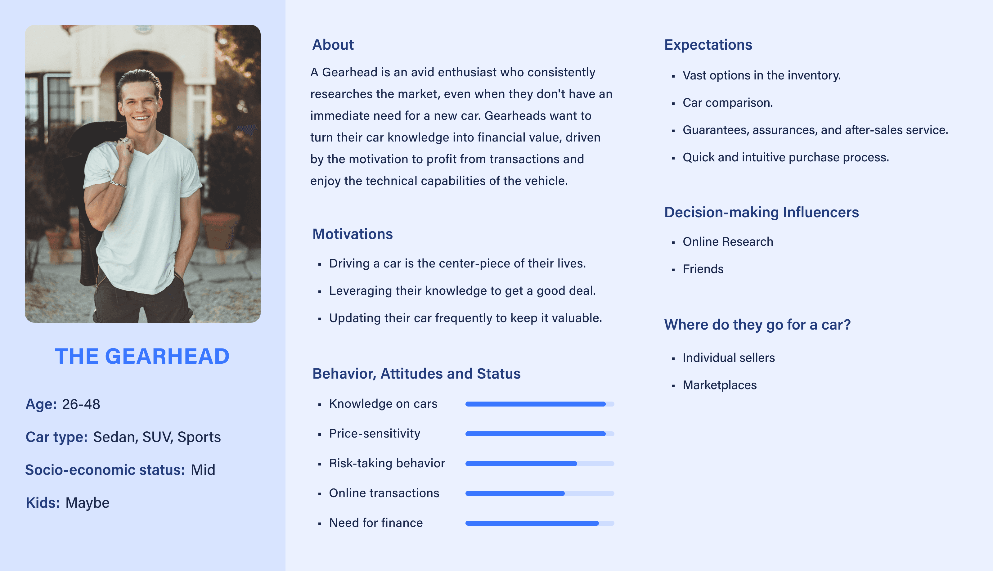
Persona 3: The Gearhead (Secondary Persona)

Persona 1: The Family Person (Primary Persona)

Persona 2: The Diligent (Secondary Persona)

Persona 3: The Gearhead (Secondary Persona)

Persona 1: The Family Person (Primary Persona)

Persona 2: The Diligent (Secondary Persona)

Persona 3: The Gearhead (Secondary Persona)

Persona 1: The Family Person (Primary Persona)

Persona 2: The Diligent (Secondary Persona)

Persona 3: The Gearhead (Secondary Persona)
Competitive Analysis
and Benchmarking
Analysed our global competitors to gain valuable insights into market trends, customer preferences, and identify our competitor's unique selling points.

Above the fold (First fold of the competitors B2C website)
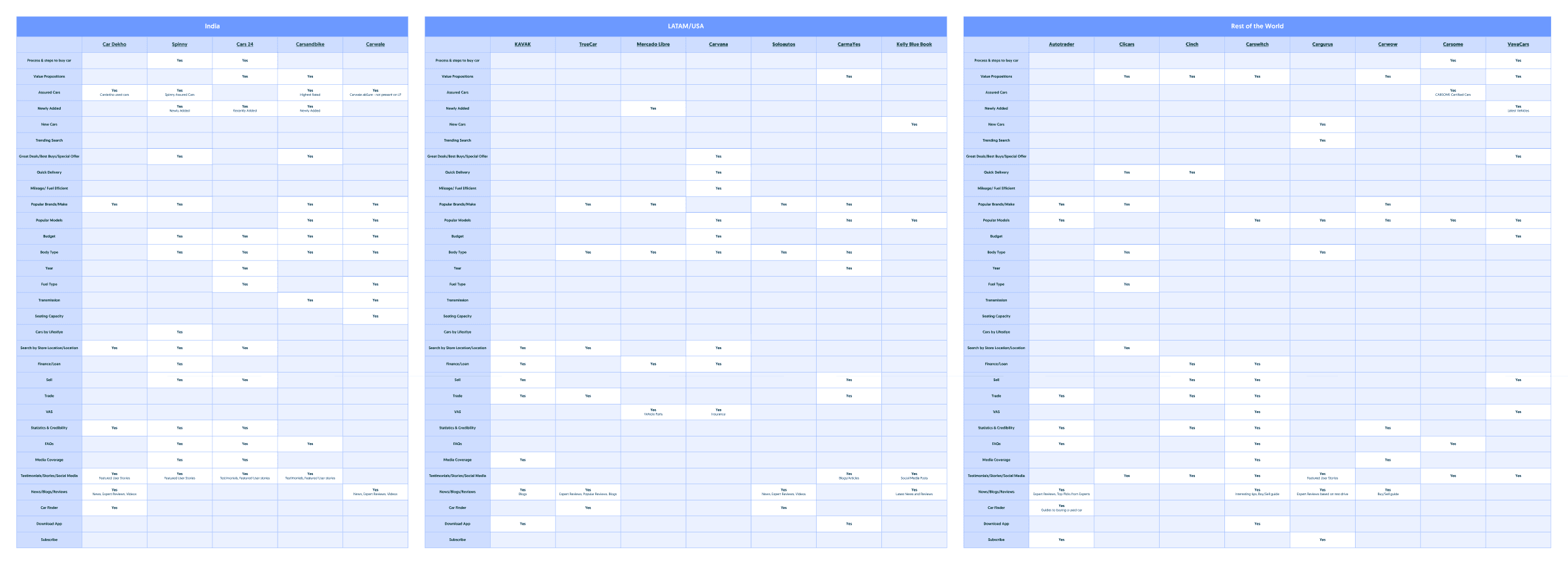
Below the fold (Rest of the competitors B2C website)
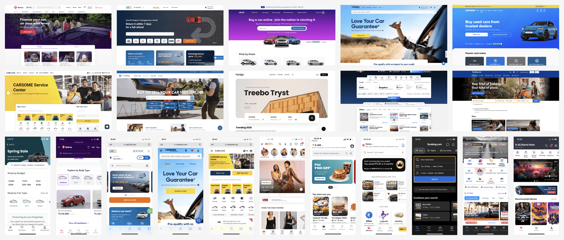
Inspiration
Taking our competitor platforms and other B2C applications as a source of inspiration and reference during the design process.
Design Explorations
Quick brainstorming done to explore different concepts and approaches while taking the valuable insights derived from analytical data and user research into consideration.
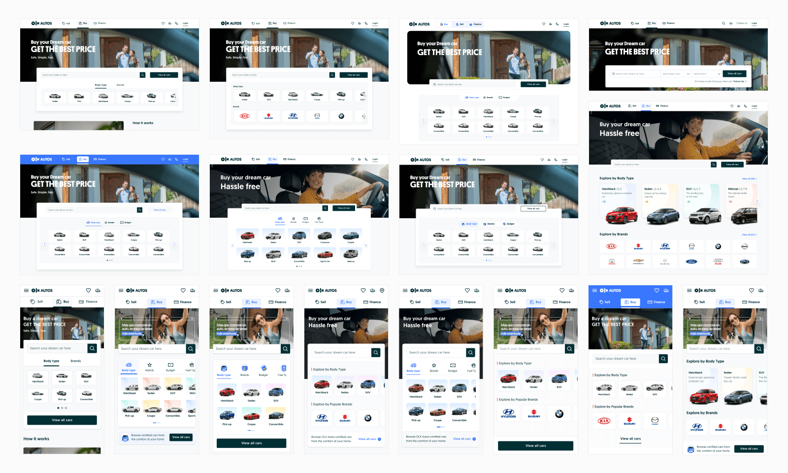
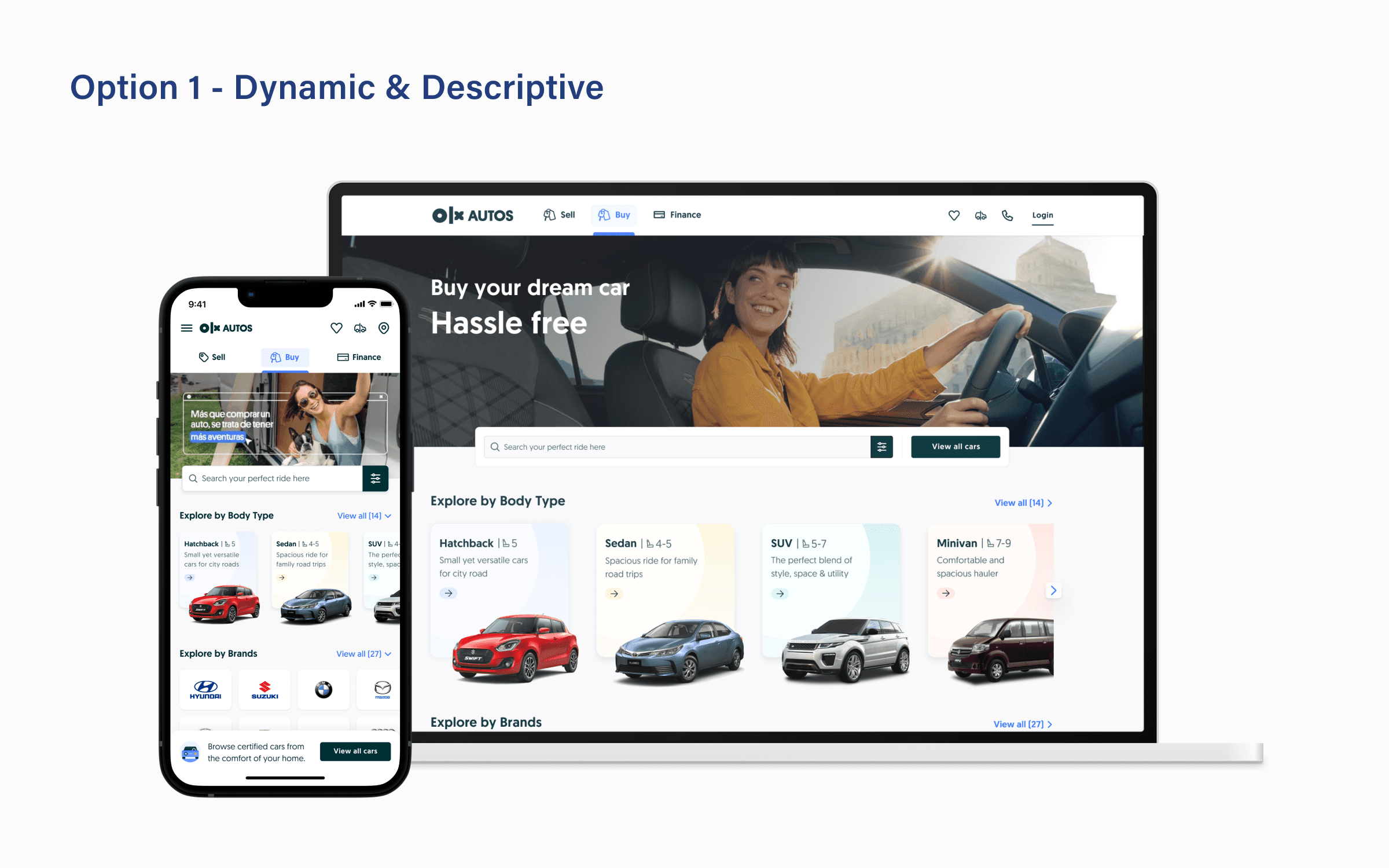
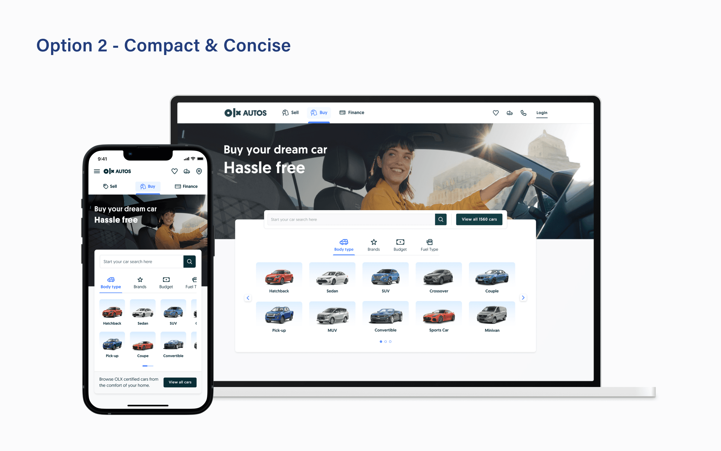
Explored approaches for better placement of search bar, and redesigning the navigation bar and B2C widget.
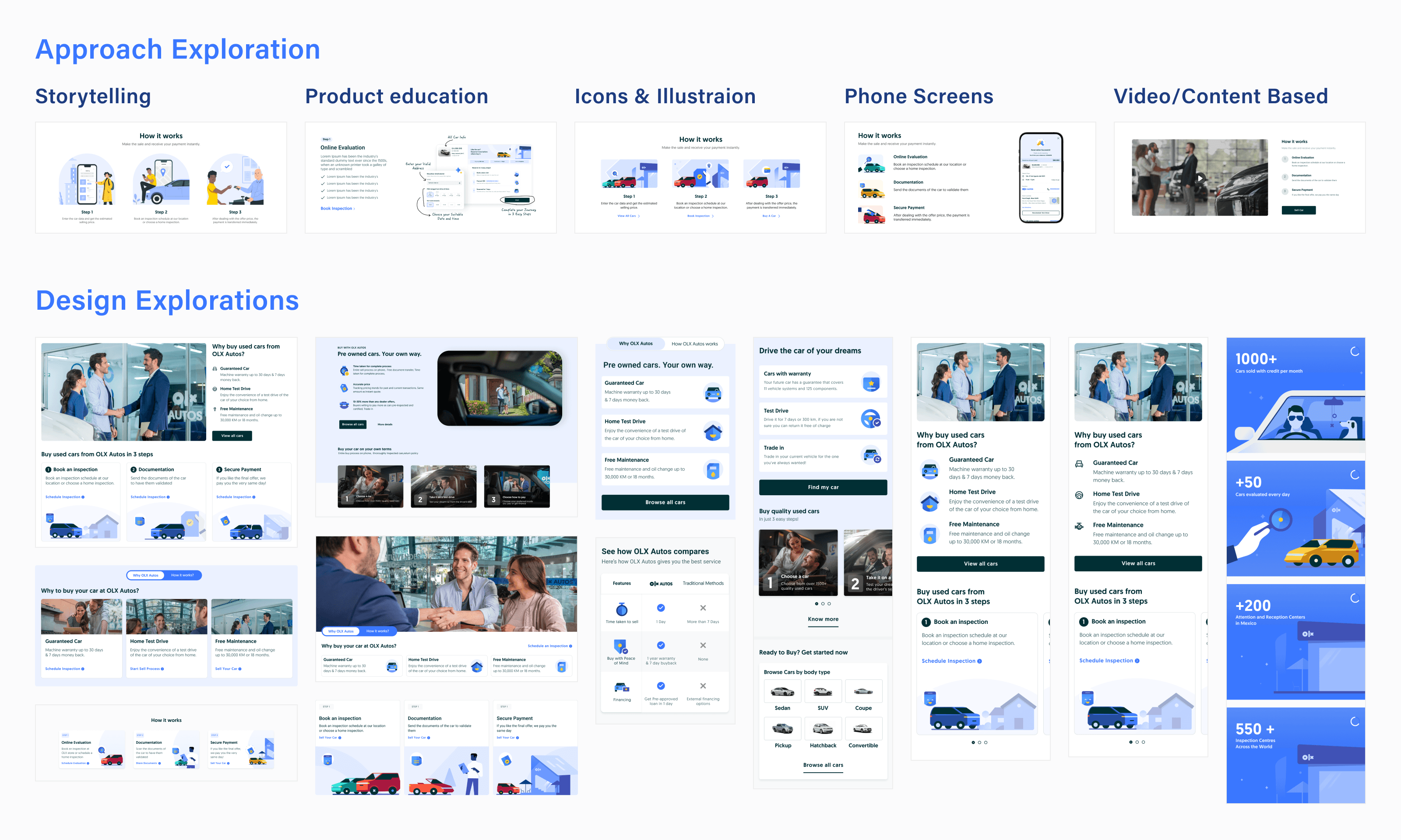
Explored approaches to effectively communicate the value propositions and the buying process.

Explored approaches for better placement of search bar, and redesigning the navigation bar and B2C widget.

Explored approaches to effectively communicate the value propositions and the buying process.

Explored approaches for better placement of search bar, and redesigning the navigation bar and B2C widget.

Explored approaches to effectively communicate the value propositions and the buying process.

Explored approaches for better placement of search bar, and redesigning the navigation bar and B2C widget.

Explored approaches to effectively communicate the value propositions and the buying process.
Proposed Approaches
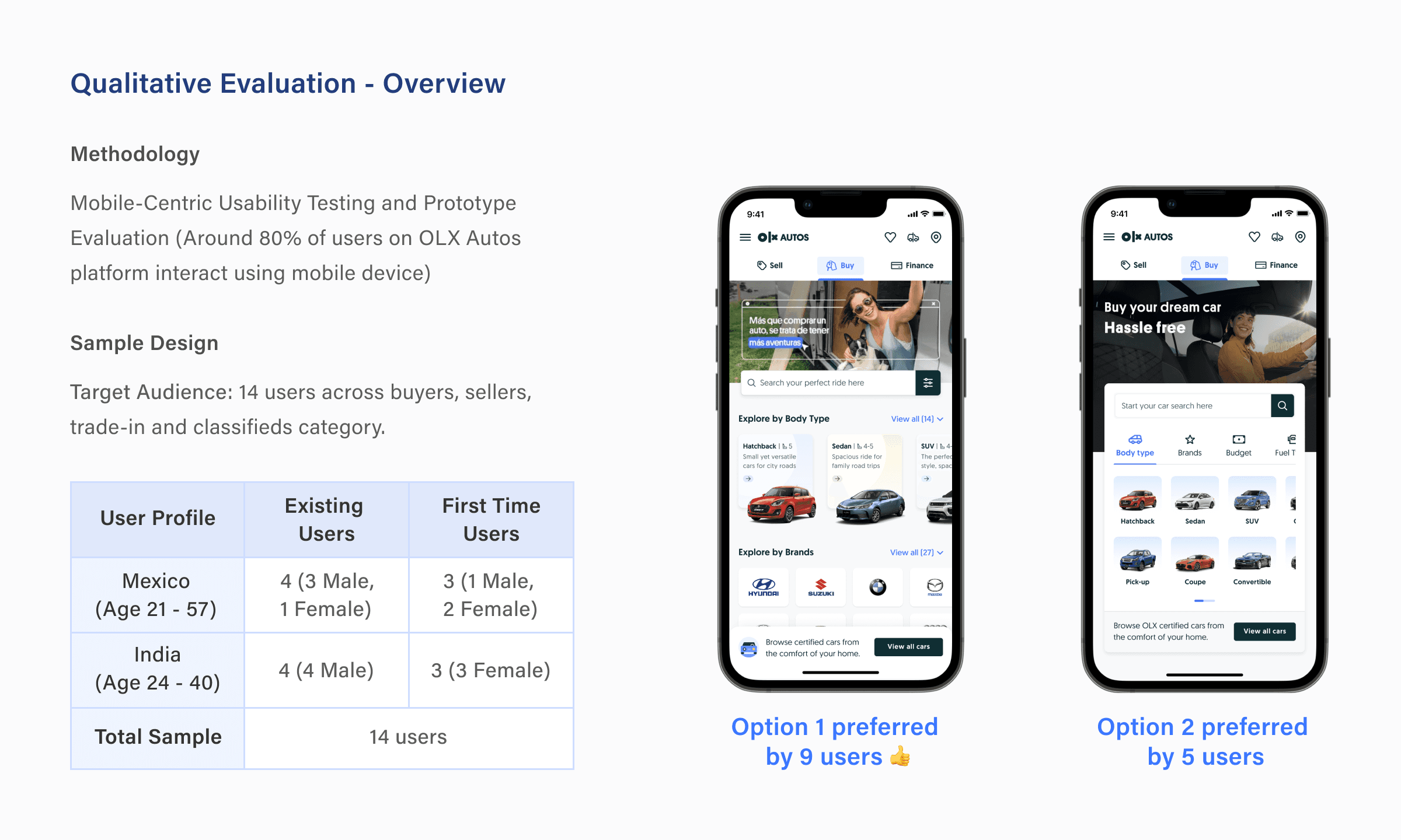
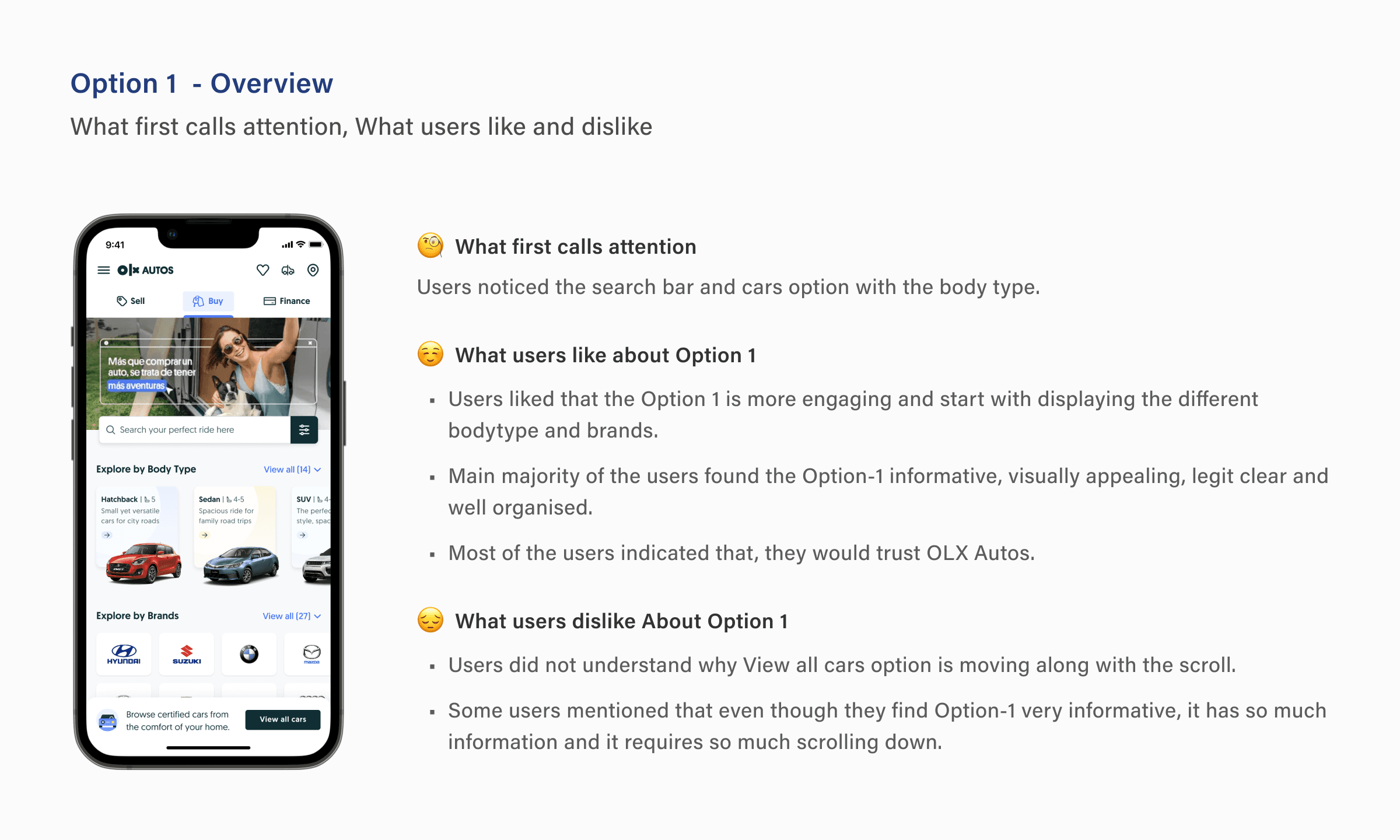
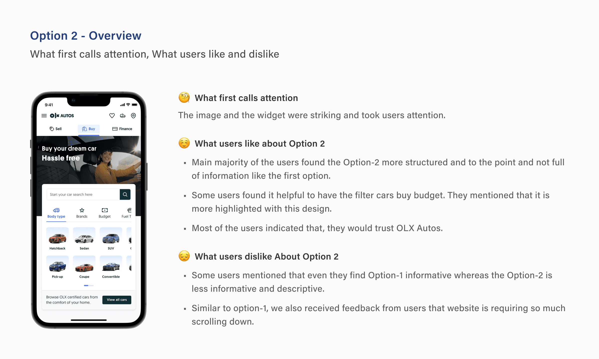
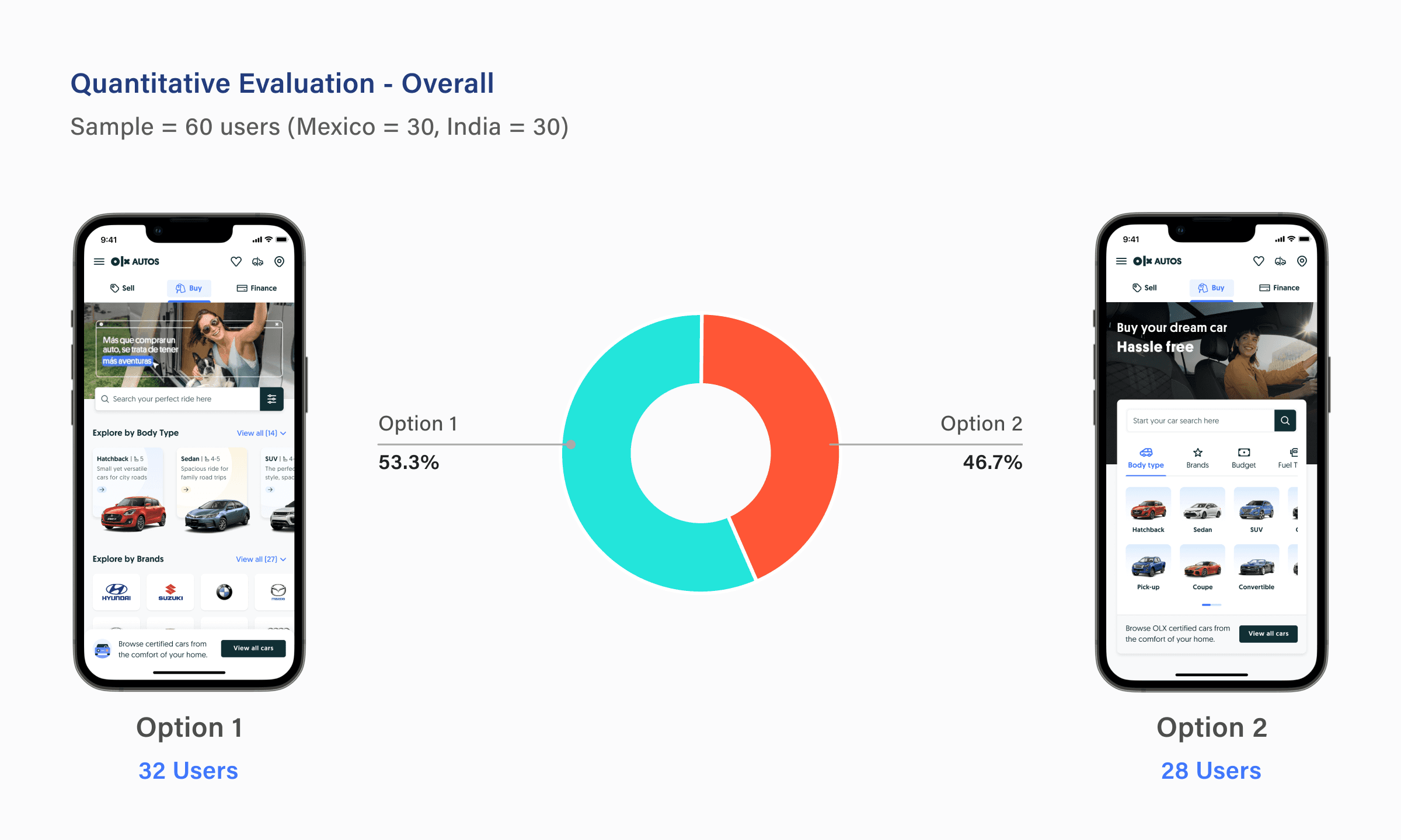
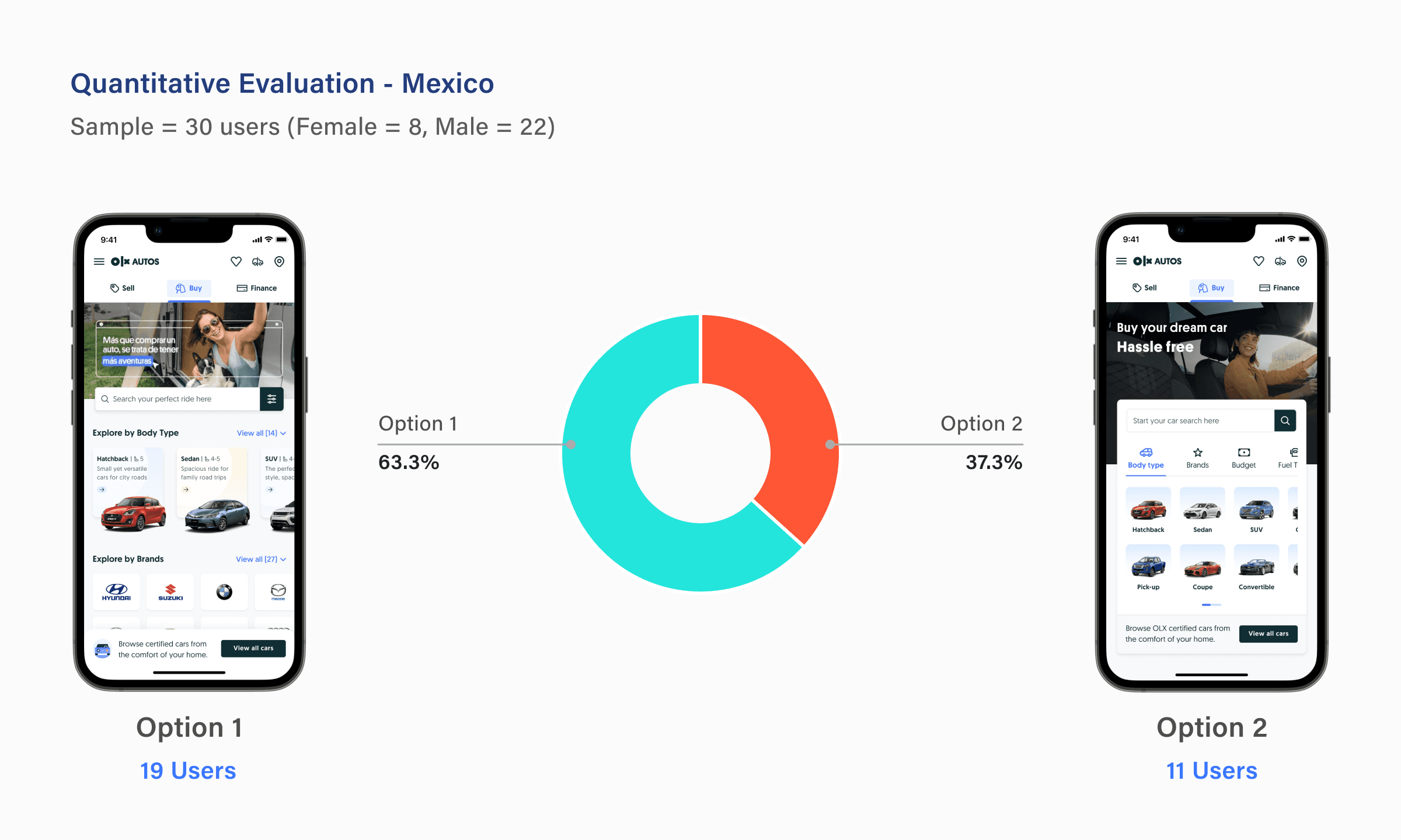
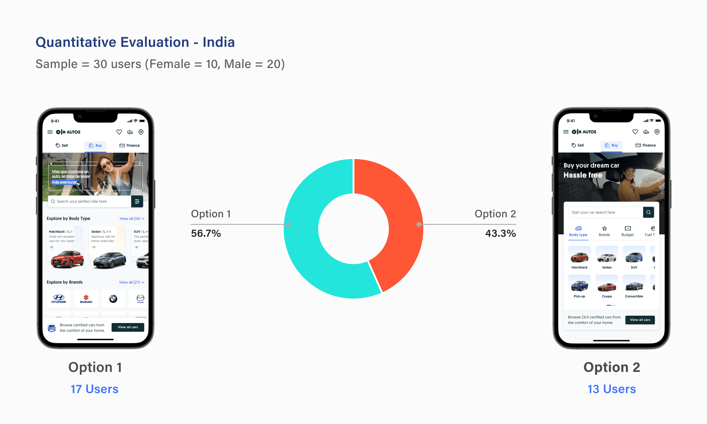
After exploring multiple design approaches, we selected two distinct options: first option with a bold and informative approach, and the other with a compact and organised layout.
Prototype Evaluation and Usability Testing
Validating our proposed concepts and approaches and gathering user feedback by testing and evaluating the following aspects:
Identifying any potential navigation confusion faced by users
Search and discoverability experience
Assessing if we successfully convey the value of OLX Autos with the new design?
Evaluating the overall intuitiveness of the landing page
Assessing which design approach is most understandable and is communicating better from the user's perspective?
Understanding user expectations and their desired requirements on the page.
Final Solution
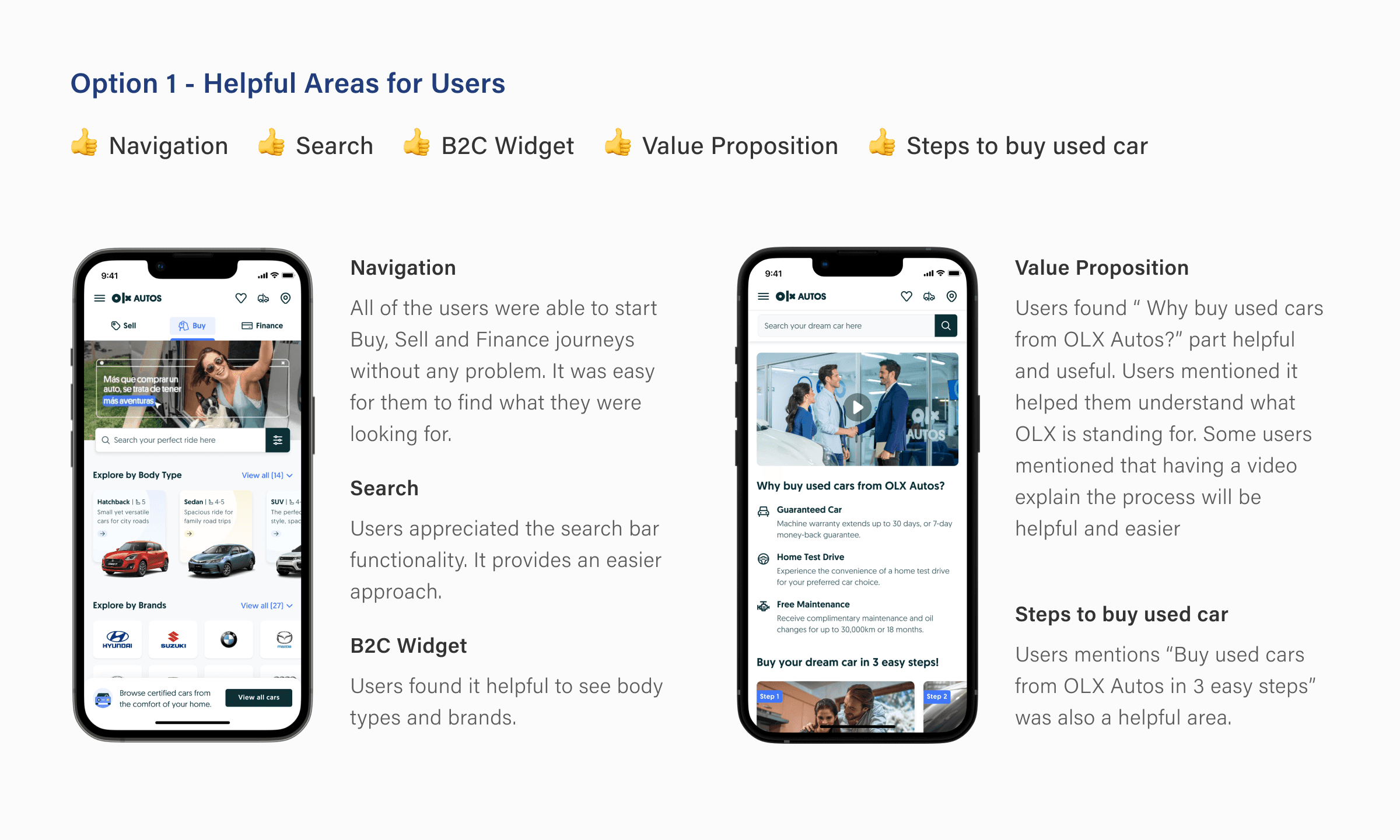
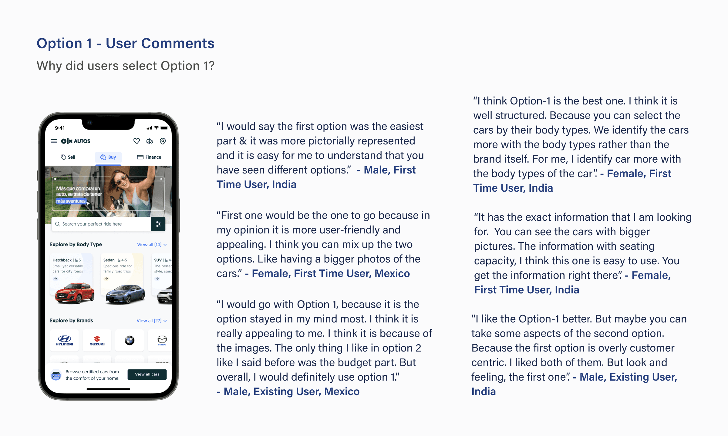
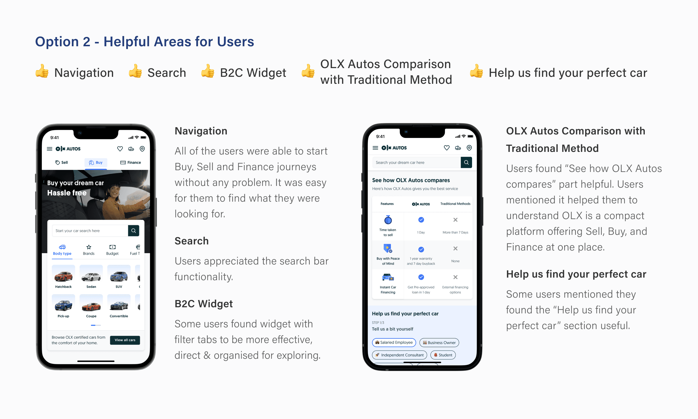
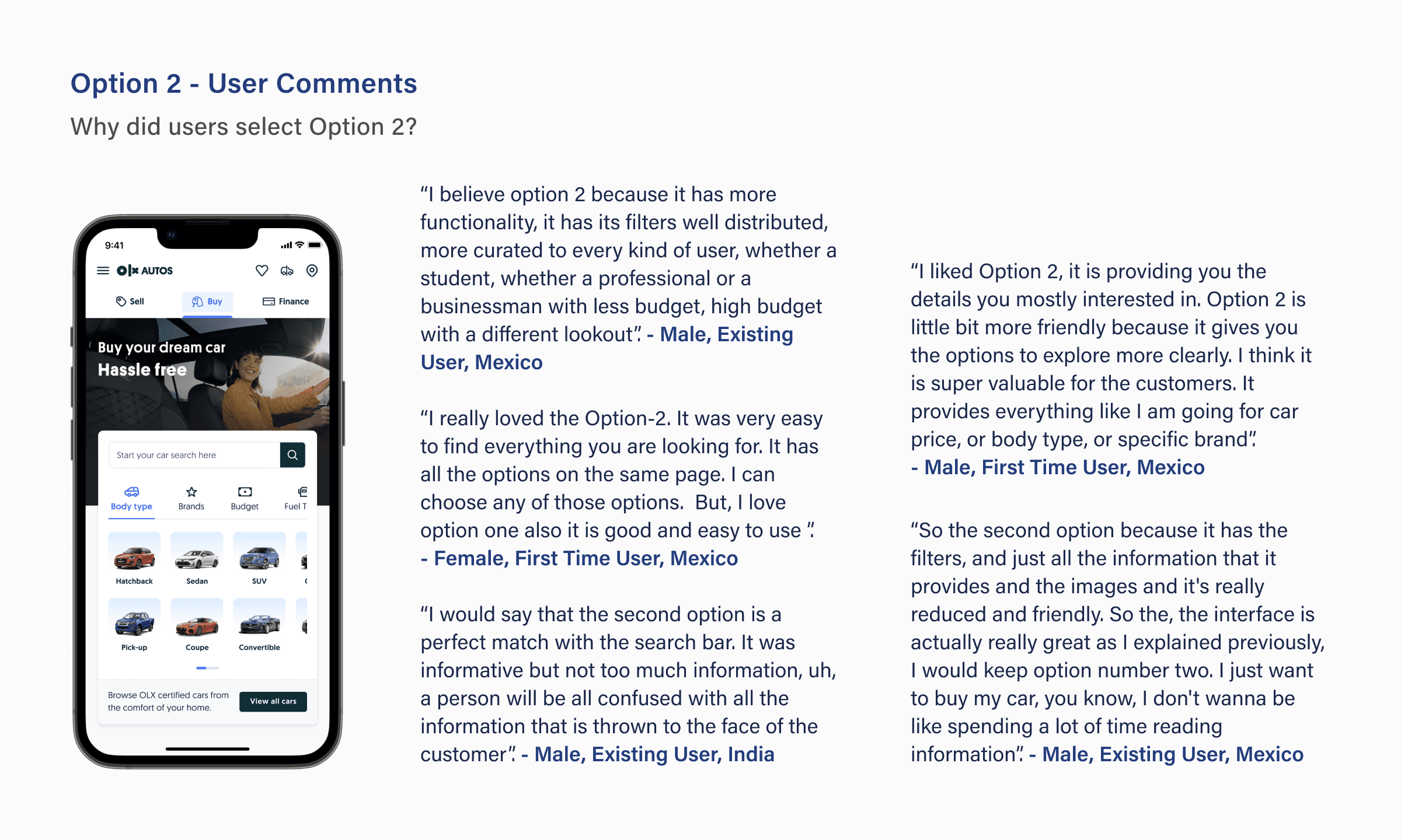
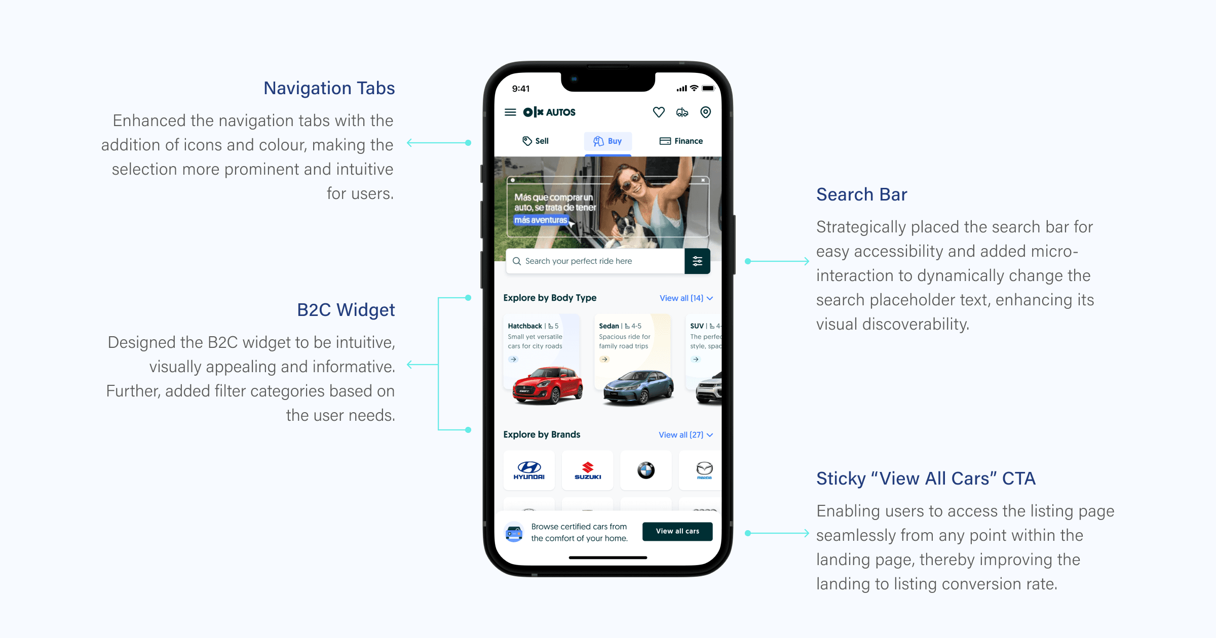
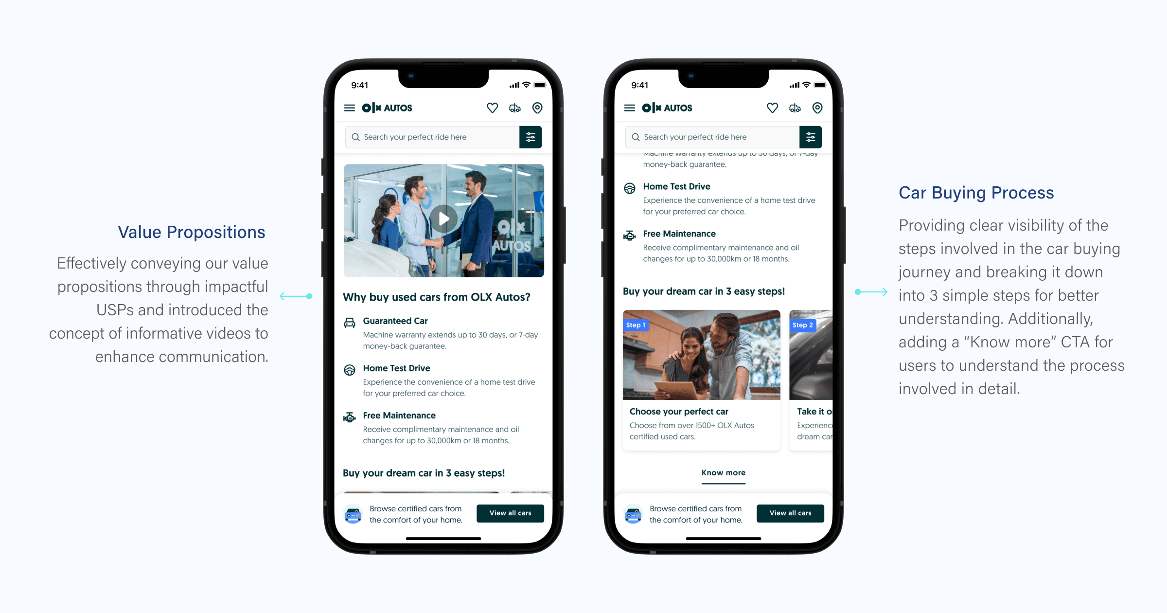
After careful consideration and user feedback, we decided to move forward with "Option 1 - Dynamic & Descriptive" as our final solution. This option proved to be more engaging, visually appealing, and informative for the majority of users. Additionally, we incorporated sections and features from Option 2 that users found particularly helpful, resulting in a finalised version that combines the best of both options.
Navigation Tabs, Search & B2C Widget
New Design
Old Design
Value proposition & steps involved to buy car
New Design
Old Design
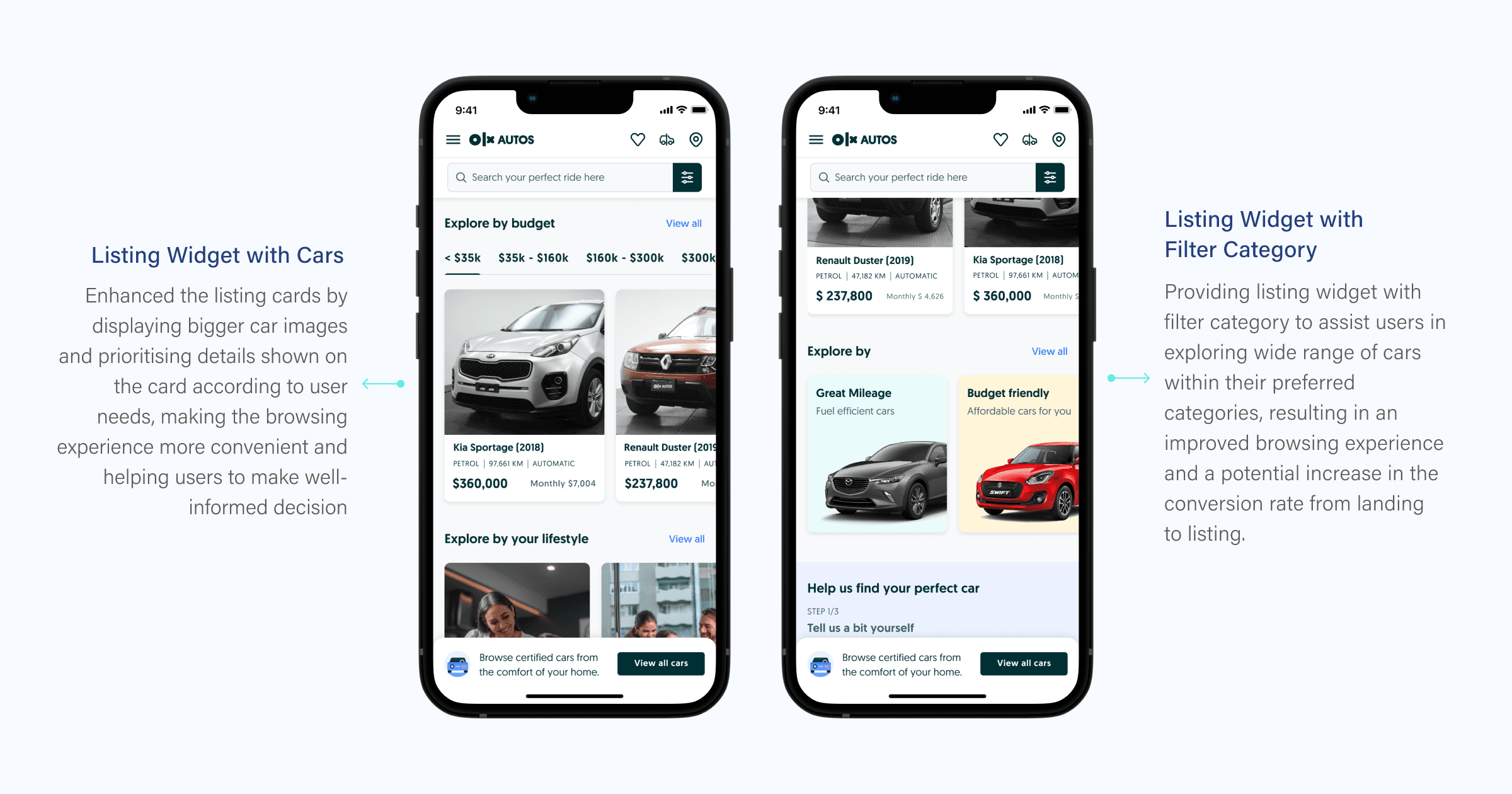
Listing Widgets
New Design
Old Design
High-Fidelity Prototype
Revamped B2C Landing Page
New Design
Old Design
Next Steps
A/B Testing
Implementing an A/B test involving both the redesigned version and the current design, in order to gain valuable insights derived from analytical data and metrics.
